Rendered LWC

In the Evolution of Frameworks we traced Salesforce’s UI progression from early S-controls through Visualforce and Aura to Lightning Web Components, and the previous two guides covered Visualforce and Aura in depth. This article is the one the rest of the series has been building toward: Lightning Web Components (LWC), the framework Salesforce recommends for new custom UI and the one you will spend most of your time in as a modern Salesforce developer.
LWC arrived in the Spring ’19 release, and the design goal behind it explains most of how it behaves. Where Aura was built before modern web standards settled, LWC is built on them: custom elements, templates, and shadow Document Object Model (DOM) from the Web Components family of standards, with standard JavaScript classes and modules doing the work. The framework layer is deliberately thin. Most of the code you write in an LWC is just JavaScript and HTML, which means the skills transfer in both directions: web developers pick up LWC quickly, and LWC developers learn things that remain useful outside Salesforce.
These days I come at LWC more from the solution and governance side, reviewing and approving the components developers build, than from writing it full-time, and my own background leans backend, so even when I was hands-on, LWC was a periodic part of the job rather than all of it. That vantage point shapes what follows: the patterns that hold up in review and in production, and the rough edges that tend to surface once real users and real data are involved. Because Salesforce ships three major releases each year, treat details in this guide as accurate to the review date above and cross-check the official Salesforce release notes where behaviour may have changed.
This guide assumes you want to build with LWC, not just recognise it. It works from your first component through templates, data access, communication, navigation, styling, security, and testing, then finishes with a capstone you can deploy to a real org. If you are arriving from Aura, watch for the “coming from Aura” notes along the way: the mental-model shift, not the syntax, is what usually trips experienced Aura developers up.
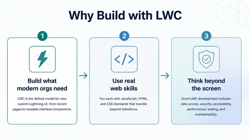
Each Salesforce UI model teaches a different way to think about building interfaces. Visualforce starts with a server-rendered page. Aura moves interaction into client-side components with a framework-specific programming model. LWC takes the next step: standards based components built with modern JavaScript, HTML, and CSS, running almost entirely in the browser.
This comparison is not about dismissing the older models. It is about knowing which tool to reach for first.
| Topic | Visualforce | Aura | LWC |
|---|---|---|---|
| Mental model | Server-rendered page + controller | Component bundle with framework-specific files | Standards-based web component |
| Where logic runs | Mostly server | Client, via framework APIs | Client, via standard JavaScript |
| State | View state across requests | Attributes with cmp.get/cmp.set |
Class fields, reactive by default |
| Best fit today | Legacy pages, PDFs, older overrides | Maintenance, wrappers, migration bridge | Most new custom Salesforce UI |
| Recommendation | Maintain | Use when required | Use by default (Salesforce’s guidance) |
If you can choose freely for new work, choose LWC.
LWC development feels more like modern web development than page editing. You work with a small bundle of files, keep those files in source control, deploy them to an org, and then place the component where it should run.
If you followed the Visualforce and Aura articles, you already have most of the Salesforce context you need. The shift into LWC depends on where you are coming from: from Visualforce, you move from whole server-rendered pages to self-contained component bundles; from Aura, you already think in bundles, so the real change is the standards-based, reactive model that replaces Aura’s framework-specific one. The next section unpacks this.
You should be comfortable with:
async/await, and array methods.What you need:
sf) for creating projects, deploying source, and working with orgs.One practical difference from Aura is worth knowing up front: you cannot create or edit Lightning Web Components in the Developer Console. LWC is source based development only, through VS Code (or Code Builder) and the Salesforce CLI. That constraint is a feature: it pushes every LWC through source control and a deploy step, which is exactly where you want your UI code to live. If you need a full setup walkthrough, see Setting Up Your Environment in Developer Mindset & Toolkit.
An LWC is a custom HTML element. It owns its template, its state, its logic, and its styling, and it exposes a deliberately narrow public surface to whatever contains it: properties in, events out. (It also listens for events from its own children, because in that relationship the component is itself the container. It can expose a few public methods for a parent to call too, but that simple in-and-out contract is the spine, and the Communication section fills in the rest.) If you hold onto that, most of the framework’s rules start to feel like consequences rather than trivia.
Where Visualforce rebuilds a page on the server and Aura wires components together through framework APIs, an LWC is much closer to the platform native model the browser itself understands:
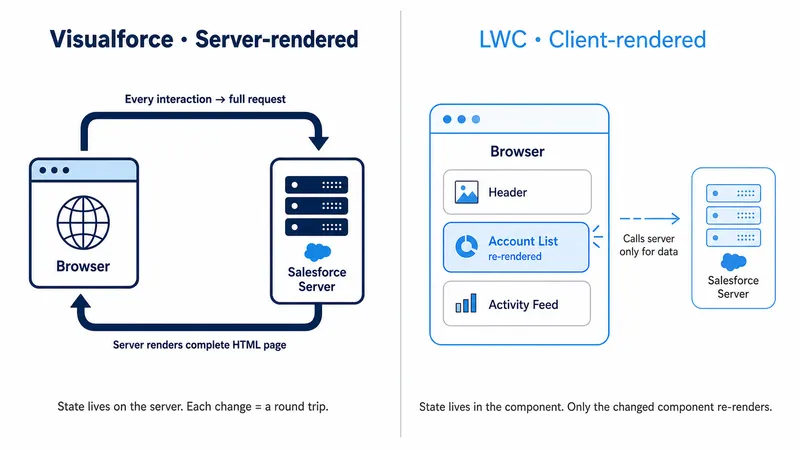
Three ideas do most of the heavy lifting:
cmp.set("v.message", ...) and the framework re-renders. In LWC you assign to a class field, this.message = 'Hello', and the framework notices and re-renders. There is no get/set API and no attribute registry; state is just fields on a JavaScript class.@api later); children send information up by dispatching events. There is no two-way binding. An input does not silently write into your state; you handle its change event and assign the field yourself. This is the single biggest adjustment for Aura developers, where {!v.name} on an input updated the attribute automatically.LWC feels predictable once you can picture what happens between a click and an update on screen. At a high level, the pattern is simple: an event changes state, and state drives what the template shows:
renderedCallback() runs if you need DOM dependent work.In the common case, clicking a button changes a field such as this.firstName, and the {firstName} placeholder in the template updates on the next render.
| Phase | Typical location | Common failure mode |
|---|---|---|
| Event handling | Template on... binding + class method |
Handler name typo, so nothing fires |
| State update | Class fields | Mutating an object or array in place instead of reassigning it, so the UI may not notice the change |
| Data provisioning | @wire / Apex call |
Not handling the “no data yet” state |
| Re-render | Template | Missing or unstable key, heavy getter logic |
| Post-render work | renderedCallback() |
Unguarded state change causing a render loop |
Keep that table in mind; the debugging section at the end of this guide builds directly on it.
In a standard Salesforce DX project, Lightning Web Components live under:
force-app/main/default/lwc/Like Aura, an LWC is never a single file: it is a bundle of related files wired together by a shared name. Unlike Aura, there is no separate controller, helper, or renderer, one JavaScript class owns all the component’s logic (although it can reference other JavaScript modules).
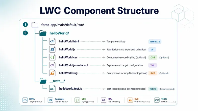
| File | Purpose |
|---|---|
.html |
The template: declarative markup with bindings and directives |
.js |
The class extending LightningElement: fields, getters, handlers, lifecycle hooks |
.js-meta.xml |
Where the component is allowed to run, and its design-time properties |
.css |
Styles scoped to this component only |
.svg |
Optional icon shown in Lightning App Builder |
__tests__/ |
Jest tests, kept in source control and never deployed to the org |
The .html, .js, and .js-meta.xml files are the core trio you will touch most often. The __tests__ folder stays local: the default .forceignore in a DX project excludes it from deployment, so your tests live with the component in Git without ever shipping to Salesforce.
The bundle is also your troubleshooting map, the same way the Aura bundle was. Display problems usually live in the template. Behaviour problems live in the class. “It works but I cannot add it to my page” problems live in js-meta.xml. Missing or wrong data usually means the wire configuration, the Apex method, or the running user’s permissions. Knowing which file owns which concern is the fastest way to narrow down a bug.
One naming rule to internalise early: the folder and files use camelCase (helloWorld), but the markup tag uses kebab-case with a namespace prefix. Salesforce converts helloWorld to hello-world and prefixes it with c-, the default namespace, so the component is used inside another template as <c-hello-world>. If your org has a registered namespace, that prefix appears instead of c.
In Aura, you told Salesforce where a component could be used by adding marker interfaces in the markup, such as implements="flexipage:availableForRecordHome". That is what “placement” means here: whether the component can be added to a record page, app page, Flow screen, Experience Cloud site, or another Salesforce surface. In LWC, that decision moves into configuration instead. The component’s *.js-meta.xml file lists the places where the component is allowed to appear, and builders such as Lightning App Builder, Experience Builder, and Flow Builder read that file to decide whether admins can see it and add it there.
The fields you will use constantly:
isExposed: must be true before the component appears in any builder.apiVersion: pins the framework behaviour the component was built against.masterLabel and description: what admins see in the builder palette.targets: the list of contexts the component supports.targetConfigs: per-target settings, including design-time properties.The table below explains the most relevant targets values and what each one enables.
| Target | What it enables |
|---|---|
lightning__AppPage |
App pages in Lightning App Builder, including pages used inside Lightning apps such as console apps |
lightning__HomePage |
Home pages in Lightning App Builder |
lightning__RecordPage |
Record pages in Lightning App Builder, with record context available |
lightning__Tab |
Custom Lightning tabs in Lightning Experience or the Salesforce mobile app |
lightning__FlowScreen |
Screen flow steps in Flow Builder |
lightning__UtilityBar |
Utility bar items in Lightning apps |
lightning__RecordAction |
Record-page quick actions in Lightning Experience |
lightning__UrlAddressable |
Direct navigation by URL in supported containers such as Lightning Experience and the Salesforce mobile app |
lightningCommunity__Page |
Drag-and-drop components on Experience Builder pages |
lightningCommunity__Default |
Editable design properties in Experience Builder when the component is selected; typically used alongside lightningCommunity__Page |
A few practical notes on this table:
lightning__RecordPage provides context, but you still have to ask for it. Declaring the target makes the component placeable on record pages; you receive the record’s ID and object type only by declaring @api recordId and @api objectApiName fields. (@api marks a property as public, so the page or a parent component can set it. It comes up a few times before its own section, The Three Decorators, explains it in full.)lightning__RecordAction, a targetConfig of actionType ScreenAction opens your component in a modal, while Action runs it headless, no UI, just an @api invoke() method that executes when the user clicks the action. LWC quick actions are record-page actions in Lightning Experience, not global quick actions, and they are not supported in the standard Salesforce mobile app.lightning__UrlAddressable retires an old workaround in supported containers. For years, navigating directly to a custom LWC meant wrapping it in an Aura component that implemented lightning:isUrlAddressable. An LWC can now be the navigation destination itself in Lightning Experience and the Salesforce mobile app, although this target is not supported in Experience Builder sites.lightningCommunity__ targets.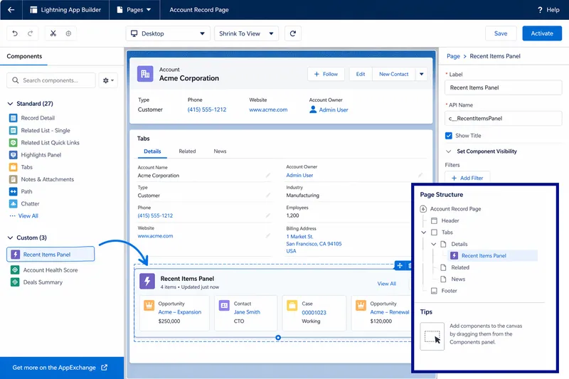
targetConfigs builds directly on the targets table above. First you declare where a component can run with entries such as lightning__RecordPage or lightning__FlowScreen; then targetConfigs lets you add settings or restrictions for one or more of those specific targets. It is also how you give admins safe configuration knobs in App Builder. Each property you declare appears in the builder’s panel, and the value flows into a matching @api field on your class.
A property can carry far more than a name and a type. The attributes you will reach for most often are:
name: must match the @api property name in the JavaScript class exactly.type: usually String, Integer, or Boolean for App Builder targets; it controls the kind of input the builder shows.label and description: the admin-facing label and help text in the builder.default: the starting value when an admin drops the component onto a page.required: prevents the admin from leaving an important setting blank.min and max: useful for Integer properties so admins stay within safe limits.placeholder: ghost text for String inputs in Lightning App Builder.datasource: turns a String property into a picklist, either from a fixed list or from an Apex-backed dynamic picklist.Not every target supports every option. For example, Flow screen components add Flow specific attributes such as role, while lightning__RecordAction does not support component properties at all.
<?xml version="1.0" encoding="UTF-8"?><LightningComponentBundle xmlns="http://soap.sforce.com/2006/04/metadata"> <apiVersion>67.0</apiVersion> <isExposed>true</isExposed> <masterLabel>Recent Items Panel</masterLabel> <description>Shows the most recent related items for the current record.</description> <targets> <target>lightning__RecordPage</target> </targets> <targetConfigs> <targetConfig targets="lightning__RecordPage"> <property name="maxItems" type="Integer" label="Maximum items" default="5" min="1" max="20" description="How many rows to display." /> <objects> <object>Account</object> </objects> </targetConfig> </targetConfigs></LightningComponentBundle>In this example, maxItems would need a matching @api maxItems field in the component’s JavaScript class. The objects element then restricts which record pages offer the component, a small touch that saves admins from placing an Account-specific component on a Case page and filing a bug when it breaks.
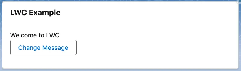
I have never managed to learn a framework by reading about it; the concepts only stick once I have built something with them and watched it run. So before we take LWC apart section by section, build this. It is deliberately minimal: a card with a message and a button that changes it. The point is not the feature, it is the round trip, create a bundle, bind state to a template, deploy, and see it render in Lightning App Builder.
helloLwc, choose JavaScript if prompted for a language (TypeScript is also offered, but stick with JavaScript here), and choose force-app/main/default/lwc. (From a terminal, the equivalent is sf lightning generate component --name helloLwc --type lwc --output-dir force-app/main/default/lwc.)force-app/main/default/lwc/helloLwc/, confirm you can see helloLwc.html, helloLwc.js, and helloLwc.js-meta.xml. You will also see a __tests__ folder for Jest tests, which we are not using here.helloLwc.js with the sample JavaScript below.helloLwc.html with the sample HTML below.helloLwc.js-meta.xml with the sample XML below so the component can be added in App Builder.sf org login web if you need to log in).sf project deploy start --source-dir force-app/main/default/lwc/helloLwc.helloLwc onto the canvas, and save.import { LightningElement } from 'lwc';
export default class HelloLwc extends LightningElement { message = 'Welcome to LWC';
handleClick() { this.message = 'Button clicked'; }}<template> <lightning-card title="LWC Example"> <div class="slds-p-around_medium"> <p>{message}</p> <lightning-button label="Change Message" onclick={handleClick}></lightning-button> </div> </lightning-card></template><?xml version="1.0" encoding="UTF-8"?><LightningComponentBundle xmlns="http://soap.sforce.com/2006/04/metadata"> <apiVersion>67.0</apiVersion> <isExposed>true</isExposed> <targets> <target>lightning__AppPage</target> <target>lightning__HomePage</target> </targets></LightningComponentBundle>This is deliberately the same component built in the Aura guide, the same card, the same button, the same “Welcome” message that becomes “Button clicked”, so the contrast is the framework and nothing else. The important ideas are simple, and they echo the mental model section: message is just a class field, {message} reads it in the template, and assigning to it in handleClick() is all it takes for the UI to update. Where Aura needed an <aura:attribute> declaration and cmp.set("v.message", ...) to change it, LWC uses a plain field and a plain assignment, no attribute markup, no cmp.set, and no framework method between you and your own state.
Rendered LWC
After click
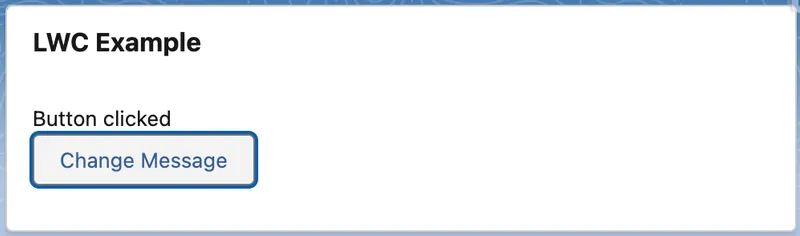
For hands-on practice beyond this first build, the Lightning Web Components Basics Trailhead module reinforces these concepts in small, practical units, and the official LWC Recipes sample app gives you a working, reviewable example of almost every pattern in the rest of this guide.
With a full component built end to end, the rest of this guide slows down and takes the pieces one at a time. It follows the order most people learn LWC in practice: template first, then the JavaScript class, then record context and data, then communication, lifecycle, navigation, and the production concerns of styling, security, performance, and testing. You do not need to memorise every section; the goal is that when you open real LWC code, you recognise each part and know where to make a change safely.
An LWC template is plain HTML plus a small set of framework directives. The design constraint that surprises Aura and Visualforce developers is that templates cannot contain expressions. Where Aura let you write {!v.count + 1} straight in the markup, LWC allows only {property}, a bare reference to a single field or getter, with no maths, method calls, or logic inside the braces. Anything that needs computing has to move into a getter on the JavaScript class, a method that works out the value and hands it back for the template to show.
This caught me out when I first moved from Aura to LWC, I kept reaching for those inline expressions and the template simply would not accept them. If you are not coming from Aura or Visualforce, you will never miss them; it is only a habit you have to unlearn if you already have it. Either way it feels restrictive for about a day, and then you notice the payoff: every piece of display logic has a name, lives in one place, and can be unit tested.
In the template markup, you bind a field or getter by wrapping its name in curly braces, so {property} displays whatever the field or getter named property holds:
<template> <p>Hello, {firstName}</p> <p>{itemSummary}</p></template>Here firstName is a plain field and itemSummary is a getter, but the template reads them the same way. That is the point from the section intro made concrete: the markup does not know or care whether a value is stored or computed, so you are free to move logic into a getter later without touching the template.
Use lwc:if, lwc:elseif, and lwc:else to render branches:
<template> <template lwc:if={isLoading}> <lightning-spinner alternative-text="Loading"></lightning-spinner> </template> <template lwc:elseif={error}> <p class="slds-text-color_error">Something went wrong.</p> </template> <template lwc:elseif={hasItems}> <p>{itemSummary}</p> </template> <template lwc:else> <p>No items selected.</p> </template></template>As with {property} bindings, the condition has to be a single field or getter, not an expression: lwc:if={hasItems} is fine, but lwc:if={items.length > 0} is not. That is why the example uses hasItems rather than the comparison inline; you push the logic into a getter (you will see hasItems defined in the getters section below). Notice too that the directive sits on a <template> tag here. You can put it on a real element instead, but wrapping it in a <template> lets you show or hide a whole group at once without adding an extra node to the page.
If you are reading older code you will see if:true and if:false doing this job. They still run, but they are legacy and no longer recommended. lwc:if/lwc:elseif/lwc:else are the current directives, and new code should use them. Spotting if:true in a codebase is a useful freshness signal, the component predates the modern syntax or was written from old examples.
Use for:each with a stable key:
<template> <template for:each={contacts} for:item="contact"> <p key={contact.Id}>{contact.Name}</p> </template></template>Every repeated element needs a key: a unique, unchanging ID for that row, such as contact.Id. It goes on the element you repeat, the <p> above. The engine uses the key to keep track of which row is which between renders. So when the list changes, it can see what was added, removed, or moved, and update only those rows instead of rebuilding the whole list.
The one rule that catches people out: never use the array index as the key. The index shifts the moment you insert or delete an item, so it stops pointing at the same record, and the rows fall out of step with the data. The tell-tale sign is list state, such as a ticked checkbox, staying put while the record beneath it changes. Delete a row, and the tick ends up on the wrong contact. I have had to debug exactly this, and, a little embarrassingly, it took me far longer than it should have to realise the key was the culprit rather than my event handling.
One related directive for later: when you need an item’s position in the list, for first or last styling or a row number, swap for:each for iterator:it. It runs the same loop but also gives you it.first, it.last, it.index, and it.value for each item.
Getters are where the “no expressions in templates” rule pays off:
get itemSummary() {    return `${this.items.length} item(s) selected`;}
get hasItems() {    return this.items.length > 0;}
A quick note on the syntax in itemSummary: the backticks (the ` character, usually next to the 1 key) make a JavaScript template literal, a string that can have values slotted into it, and ${...} is how you slot one in, here turning items.length into text like “3 item(s) selected”. It looks like the {property} braces from the HTML template, but the two are unrelated: ${...} is plain JavaScript running inside the class, while {property} is LWC’s template binding.
These are the same itemSummary and hasItems used in the examples above. You read a getter in the template exactly like a field, {itemSummary} or lwc:if={hasItems}. You define it with parentheses, get itemSummary() in the JavaScript, but reference it without them in the markup, as a value, not a call. Even so, a getter runs its code on every re-render, which is exactly what you want for cheap derivations and exactly what you do not want for expensive ones. If a getter does real work, such as sorting a large array or formatting hundreds of rows, compute the result once when the data changes and store it in a field instead.
The reassuring thing, if LWC is new to you, is that most of the JavaScript is just JavaScript: a class with fields, methods, and getters, plus a few imports for what it needs. Only two parts belong to the framework itself, and both are small. Every component extends a base class called LightningElement, and a few special markers called decorators let you flag a field or method for particular treatment.
import { LightningElement, api } from 'lwc';
export default class ContactBadge extends LightningElement {    @api recordId;          // public: set by the page or a parent component    status = 'Ready';       // private state: reactive by default
    get isReady() {        return this.status === 'Ready';    }
    handleActivate() {        this.status = 'Active';   // assignment triggers re-render    }}
That short example already shows the shape of almost every component. It extends LightningElement, the base class. @api recordId is a public field the outside world can set, status is a plain field the component keeps to itself, isReady is a getter that derives a value, and handleActivate is a method that changes state. Notice the last line: assigning a new value to a field is what tells LWC to re-render.
A decorator is the @name you write immediately before a field or method. It does not change the value itself; it tells LWC to treat that field or method in a particular way. There are only three, and in everyday work you reach for one of them constantly and the other two rarely.
| Decorator | What it does | When you reach for it |
|---|---|---|
@api |
Makes a field or method public, so a parent component or Lightning App Builder can set it | Component inputs, design-time properties, letting a parent call a method |
@wire |
Reads Salesforce data and keeps it up to date automatically | Loading records and other Salesforce data |
@track |
Tells LWC to notice changes made inside an object or array | Rarely, see below |
@api and @wire are the two you will reach for constantly, which is why each has a section of its own later. @api is how a component accepts input from the outside: mark a field with it and a parent component or a Lightning page can set that field; mark a method with it and a parent can call that method. It is the backbone of Component Communication. @wire is how a component reads Salesforce data without you writing the code to fetch it and keep it fresh; The Wire Service covers it in full. That leaves @track, the one you can mostly forget about.
@track is mostly a legacy concept in modern LWC. Since Spring ’20, fields are reactive by default, so you usually do not need a decorator just to make the UI update. The main time @track still matters is when you mutate an object or array in place, such as changing a nested property (this.draft.name = 'New') rather than replacing the whole value. In most code, you can avoid that by creating a new object or array; the next section shows the better pattern to use instead. Old habits die hard, though: I still catch myself adding @track out of habit, then removing it again on a later pass.
The rule behind all of this is simpler than the jargon suggests: to update the screen, give a field a new value rather than reaching into the value it already holds and editing its contents.
this.items = [...this.items, newItem], where the ... (the spread operator) copies the existing items (this.items) into a new array alongside the new one (newItem).this.items.push(newItem) adds to the same array without replacing it, and the framework may not notice, so nothing on screen updates.@track. Building new values with array methods such as map and filter, or with the ... spread, keeps re-renders predictable, and it matches how the data you load from Salesforce already behaves.A component’s imports come from a few different places. The core framework lives in lwc (LightningElement and the decorators above). Base platform features such as wire adapters, navigation, and toast messages come from lightning/* modules, and your own shared code and child components come in by relative or c/* paths. The @salesforce/* family is the imports this section is about, they are special paths for pointing at platform resources, Apex methods, fields, labels, files, the current user, by reference instead of hardcoding their names as plain text.
| Import | Gives you |
|---|---|
@salesforce/apex/ClassName.methodName |
An Apex method as a callable function (the method must be marked @AuraEnabled; see Calling Apex below) |
@salesforce/schema/Account.Name |
A field reference checked at deploy time |
@salesforce/label/c.My_Label |
A custom label, translated per user language |
@salesforce/resourceUrl/myLibrary |
The URL of a static resource |
@salesforce/user/Id |
The current user’s ID |
@salesforce/i18n/locale |
Locale, currency, and timezone information |
Schema imports are the one to adopt early. Writing import ACCOUNT_NAME from '@salesforce/schema/Account.Name' means that a typo, or a field someone later deletes, fails your deployment rather than failing in front of a user. The reason it can catch these is that a schema import is a real reference to a piece of metadata, not just text: when you deploy, the platform resolves Account.Name against your org’s actual schema, so a misspelt or missing field has nothing to resolve to and the deployment is rejected. It also registers the component as depending on that field, which is why someone deleting the field later is forced to deal with your component first. A hardcoded field name written as a string is opaque by comparison; the platform never checks it, so it breaks silently at runtime. The schema import breaks loudly at deploy time instead, which is exactly when you want a bad reference caught.
If your LWC is for a Lightning record page, Salesforce provides your component the identity of the current record and the object type. Like everything else in LWC, you still have to declare that you want it. Expose the component to lightning__RecordPage in js-meta.xml, then declare two fields, recordId and objectApiName, each decorated with @api to make it public so the page can set it:
import { LightningElement, api } from 'lwc';
export default class RecordAwareComponent extends LightningElement {    @api recordId;        // e.g. '001XXXXXXXXXXXXXXX' on an Account page    @api objectApiName;   // e.g. 'Account'}
The page sets both automatically when the component runs in a record context: an Account ID on an Account page, a Case ID on a Case page. You never set them yourself, and they are undefined anywhere outside a record page, which is worth handling if the component also targets App or Home pages.
Think of recordId as the page handing your component the identity of the current record. What you do with that identity is the subject of the next three sections.
That is the next step in the learning journey too: once you know what component you are building and which record it is looking at, the next question is how it gets data.
Almost every component is there to do something with data. It may show a record, let someone edit one, or run an action on the server. LWC gives you a whole range of ways to do that, from the base components Salesforce ships up to your own Apex. The skill (the same one I flagged in the Aura guide) is to start with the simplest option that does the job instead of reaching for Apex out of habit. Anything you can do without Apex is server code you never have to write, secure, test, and maintain.
When I review components, a common note I leave is that a custom Apex method is doing work a base component or a wire adapter would have handled for free. It isn’t that it is wrong, it’s just more code than the job needed, and more for the next person to maintain. This is a common overengineering pattern you will see, jumping to Apex for something a base component or the wire service already does.
| Need | Start with |
|---|---|
| Display or edit a record quickly | lightning-record-form |
| Custom record form layout | lightning-record-view-form / lightning-record-edit-form |
| Let a user find and pick a record | lightning-record-picker |
| Read specific fields | getRecord wire adapter |
| Read a record’s related lists | getRelatedListRecords wire adapter |
| Read object/picklist metadata | getObjectInfo, getPicklistValues wire adapters |
| Filtered, sorted lists without Apex | GraphQL wire adapter |
| Custom query, transaction, or callout | Apex |
| Refresh data after a change | refreshApex, notifyRecordUpdateAvailable, RefreshView API |
The official data guide walks the same ladder. The sections below cover the rungs you will use most.
For everyday record UI, reach for the base record components before you write anything custom. They sit on top of Lightning Data Service (LDS), the platform’s client-side data layer, and you get a lot for free because of it. Records come from a shared cache, a save in one component shows up in every other component on the page using the same record, and the running user’s field-level security and sharing are respected automatically. No Apex, nothing to secure, nothing to unit test on the server.
<template> <lightning-record-form record-id={recordId} object-api-name={objectApiName} layout-type="Full" mode="view"> </lightning-record-form></template>That single tag, <lightning-record-form>, renders a full record view with inline edit, validation, and security handling. When you need more control over the layout but still want LDS doing the work, step down to the form pair, lightning-record-edit-form and lightning-record-view-form:
<template> <lightning-record-edit-form record-id={recordId} object-api-name="Account" onsuccess={handleSuccess}> <lightning-messages></lightning-messages> <lightning-input-field field-name="Name"></lightning-input-field> <lightning-input-field field-name="Industry"></lightning-input-field> <lightning-button type="submit" label="Save" variant="brand" class="slds-m-top_small"></lightning-button> </lightning-record-edit-form></template>Two newer additions are worth knowing because they delete whole categories of custom code. The first, lightning-record-picker (GA Spring ’24), gives you a search and select input for any supported object, the kind of component nearly every org used to hand-build in Apex. The second, the getRelatedListRecords wire adapter, reads a record’s related lists directly with no Apex at all, and the capstone at the end of this guide uses it instead of a controller.
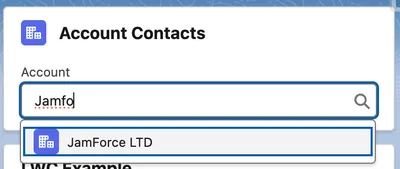
Screenshot of an LWC with the lightning-record-picker as the user is typing and before selection.
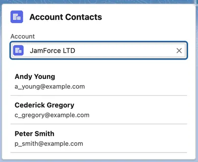
Screenshot of an LWC after the user has selected a record using the lightning-record-picker and using the getRelatedListRecords to show related records.
The pattern behind all of this is the same advice as the Aura guide, brought up to date: the page hands your component the record ID, you hand it to a record-aware component or adapter, and the platform does the loading, saving, caching, and security. You move up to Apex only when you hit something this layer cannot do.
Sometimes you do not want a ready-made form or view, you just want the data so you can present it your own way. That is where the wire service comes in. A wire adapter is a reactive data source: you declare what you want, the framework fetches it, keeps it cached through LDS, and fetches it again whenever the inputs change.
import { LightningElement, api, wire } from 'lwc';import { getRecord, getFieldValue } from 'lightning/uiRecordApi';import ACCOUNT_NAME from '@salesforce/schema/Account.Name';
export default class AccountSummary extends LightningElement {    @api recordId;
    @wire(getRecord, { recordId: '$recordId', fields: [ACCOUNT_NAME] })    account;
    get name() {        return getFieldValue(this.account.data, ACCOUNT_NAME);    }}
Reading this example top to bottom, the component imports the getRecord adapter and the getFieldValue helper, plus a reference to the Account.Name field. It takes the record’s Id from the page (@api recordId), then wires getRecord to load that record with its Name field. The result lands in the account property, which holds a result object rather than the record directly, so the name getter reaches into account.data (the record itself) and pulls the field’s value from there with getFieldValue.
With that picture in place, a few mechanics are worth pinning down:
$ prefix makes a parameter reactive. '$recordId' tells the wire to re-run whenever this.recordId changes. Without the $, the literal string is sent once.this.account is an object with data and error properties. Before the data has loaded, both are undefined, which is your loading state, and every template that shows wire data should handle it.[...this.contacts.data] for a shallow copy, or map into your own shape.createRecord/updateRecord/deleteRecord from lightning/uiRecordApi, or through Apex.You can also wire to a function instead of a property when you want to step in as the data arrives. The function receives the same { data, error } object, so you can pull those two values out, transform them, and assign the result to your own fields.
// Same adapter and config, but the result is handed to a method@wire(getRecord, { recordId: '$recordId', fields: [ACCOUNT_NAME] })wiredAccount({ data, error }) { if (data) { this.name = getFieldValue(data, ACCOUNT_NAME); } else if (error) { this.error = error; }}Beyond getRecord, the same pattern serves object metadata (getObjectInfo), picklists (getPicklistValues), multiple records (getRecords), and related lists (getRelatedListRecords). The shape is almost always the same: import the adapter, @wire it with reactive parameters, handle data, error, and not-yet. The main exception in this guide is GraphQL, which returns errors instead of error.
GraphQL is a query language that lets you ask for exactly the fields you want, including fields across related objects, in a single request, and get a response shaped to match. For list views with filtering, sorting, and pagination, the GraphQL wire adapter (GA Winter ’24) covers ground that previously forced you into Apex:
import { LightningElement, wire } from 'lwc';import { gql, graphql } from 'lightning/graphql';
export default class TopAccounts extends LightningElement {    @wire(graphql, {        query: gql`            query topAccounts {                uiapi {                    query {                        Account(first: 5, orderBy: { Name: { order: ASC } }) {                            edges {                                node {                                    Id                                    Name { value }                                }                            }                        }                    }                }            }        `    })    accountsResult;
    get accounts() {        return (            this.accountsResult.data?.uiapi.query.Account.edges.map((edge) => ({                id: edge.node.Id,                name: edge.node.Name.value            })) ?? []        );    }}
The query here asks for the first five Accounts ordered by name and returns each one’s Id and Name. The nested uiapi, edges, and node levels are GraphQL’s standard envelope for results, which is what the accounts getter flattens into a plain list the template can loop over.
It runs in the user’s context with FLS and sharing enforced, and it caches through LDS like the other Salesforce UI API adapters. The query syntax takes an afternoon to get used to; the trade is that a filtered, sorted list needs no Apex class, no test class, and no security review of your SOQL.
The import above uses lightning/graphql, which is the v2 adapter that Salesforce now recommends. Older components may import from lightning/uiGraphQLApi (v1), which still works, but reach for v2 in any new code.
Use Salesforce’s server-side language (Apex) when the UI needs something the platform data layer cannot give you like a custom query shape, a multi-record transaction, a callout, or a server-side calculation. The method must be marked @AuraEnabled to be callable from a component (the annotation predates LWC and is shared with Aura), and how you call it depends on whether it is a read or an action.
For read-only data, annotate the method @AuraEnabled(cacheable=true) and wire it like any adapter:
public with sharing class AccountSearchController { @AuraEnabled(cacheable=true) public static List<Account> searchAccounts(String searchTerm) { String searchPattern = '%' + searchTerm + '%'; return [ SELECT Id, Name, Industry FROM Account WHERE Name LIKE :searchPattern WITH USER_MODE ORDER BY Name LIMIT 50 ]; }}import { LightningElement, wire } from 'lwc';import searchAccounts from '@salesforce/apex/AccountSearchController.searchAccounts';
export default class AccountSearch extends LightningElement { searchTerm = '';
@wire(searchAccounts, { searchTerm: '$searchTerm' }) accounts;}The cacheable=true part is what makes wiring possible, and it is a real contract, not a hint: the method must not perform database writes such as insert, update, or delete operations, which Salesforce groups under the term DML. The client may also serve repeat calls from cache without touching your server at all. That cache is also the source of the most common Apex-in-LWC bug, covered under refresh below.
A wire runs when the framework decides; an imperative call runs when you decide. So for an action the user sets off, such as saving a record, deleting one, or running a calculation, you import the method and call it yourself, like an async function:
import runScoring from '@salesforce/apex/AccountScoreController.runScoring';
async handleRun() {    this.isWorking = true;    try {        this.result = await runScoring({ accountId: this.recordId });        this.error = undefined;    } catch (error) {        this.error = error;        this.result = undefined;    } finally {        this.isWorking = false;    }}
The method’s parameters are passed together in a single object, one property per Apex parameter, with the property names matching the parameter names exactly. So runScoring(Id accountId) takes { accountId: ... }, and a two-parameter method like runScoring(Id accountId, Boolean detailed) takes { accountId: ..., detailed: ... }. If there is a name mismatch, there is not a helpful error thrown; the Apex parameter just arrives null.
The flip side of caching is staleness, and the fix depends on where the data came from:
refreshApex after your change completes. refreshApex re-runs that wire’s Apex query, skips the stale cache, and feeds the fresh result back through the same wire, so the property updates and the UI re-renders with the new data:import { refreshApex } from '@salesforce/apex';
@wire(searchAccounts, { searchTerm: '$searchTerm' })wiredAccounts;
async handleCreate() { await createAccount({ name: this.newName }); await refreshApex(this.wiredAccounts); // the whole result object, not .data}getRecord and friends): if your Apex changed records behind LDS’s back, meaning it wrote to the database directly so the cache does not yet know they changed, call notifyRecordUpdateAvailable(recordIds) from lightning/uiRecordApi to tell LDS to refetch them. Every component reading those records through LDS then updates.lightning/refresh) asks the surrounding view to refresh, which is the right tool when a flow or action finishes and the whole region should re-query.Apex errors arrive in a structured but inconsistent shape: sometimes error.body is an object with a message, sometimes an array of them. Write one helper that flattens any of these into a single message string, then reuse it everywhere instead of unpicking the shape each time:
function reduceErrors(error) { const body = error?.body; if (Array.isArray(body)) { return body.map((e) => e.message).join(', '); } return body?.message ?? error?.message ?? 'Unknown error';}This trimmed version covers the error shapes you meet most often, which is plenty for Apex calls. Production apps usually reach for the fuller reduceErrors utility in the LWC Recipes sample app, which also unpacks the record-save errors that LDS returns (the pageErrors and fieldErrors from createRecord and friends) and a few other shapes this version would otherwise report as 'Unknown error'.
On the server, throw AuraHandledException when you need to return a controlled message you would be happy for a user to read. The message arrives in error.body.message, which the reduceErrors helper above can unpack. Unhandled exceptions can return technical or inconsistent error shapes, so log the diagnostic detail on the server and give the component a safe, useful message. Then show it somewhere visible, whether a toast via ShowToastEvent (imported from lightning/platformShowToastEvent) or an inline error panel, because an error that only reaches console.error did not reach the user.
LWC keeps communication deliberately boring, and that is a strength: data flows down through properties, and signals flow up through events. If you catch yourself planning something fancier, stop and ask why before you build it.
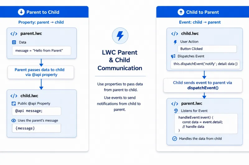
A child declares @api fields; a parent sets them in markup like any HTML attribute:
import { LightningElement, api } from 'lwc';
export default class ContactTile extends LightningElement {    @api contact;}
<!-- parent template --><c-contact-tile contact={selectedContact}></c-contact-tile>A quick reminder on that tag: to drop a child into a parent’s template, you use the kebab-case form of its name with the c- namespace prefix. The contactTile bundle becomes <c-contact-tile>, and each @api field is set as an attribute (contact={selectedContact}).
One piece of advice keeps this clean: a child should never change a value it is given. Treat @api values as read-only, and if the child needs something different, it asks the parent through an event rather than editing the value itself. The moment a component starts editing its own inputs, you risk the worst sort of bug to chase down: a value changes somewhere on the page and nothing tells you which component did it. The way a child asks for that change instead, by sending an event up to its parent, is the subject of the next section.
A parent can also call public methods on a child, not just pass it data. Mark a method on the child with @api, then in the parent grab the child element from your own template with this.template.querySelector('c-contact-tile') and call the method straight on it: this.template.querySelector('c-contact-tile').focusFirstField(). Use this only to tell a child to do something at a particular moment, such as focus an input, reset itself, or open. Data should still flow down through @api properties; methods are for one-off actions, not for handing values to the child.
Events handle the reverse direction: a child dispatches a standard DOM CustomEvent, and the parent listens for it in its template with on followed by the event name:
// child: runs when the user picks this contacthandleSelect() { this.dispatchEvent(new CustomEvent('contactselect', { detail: { id: this.contact.id, name: this.contact.name } }));}<!-- parent template --><c-contact-tile contact={contact} oncontactselect={handleContactSelect}></c-contact-tile>// parenthandleContactSelect(event) { this.selectedName = event.detail.name;}Following the round trip: the child builds a CustomEvent named contactselect, puts a small payload in its detail (here the contact’s id and name), and dispatches it. In its template, the parent says it is listening by adding oncontactselect to the child tag and pointing it at a handler, handleContactSelect. When the event fires, that handler runs and reads the payload back off event.detail. The child only announces that something happened and hands up the details; the parent decides what to do with them.
The event naming rules are simple: all lowercase, no spaces or hyphens, and do not put on in the name yourself. You add on only in the template, where you listen, so an event named contactselect is bound as oncontactselect. Bake on into the name and you would end up listening for ononcontactselect. Put data in detail only, and keep it serialisable: passing objects with functions or live component references through events couples components in ways events were meant to avoid.
By default, a custom event reaches only the parent that is directly listening for it. It does not travel any further up the page (it does not bubble through ancestor elements), and it does not cross the shadow DOM boundary around the component. For nearly all parent-to-child communication that is exactly what you want: the signal goes straight to the component that cares. You can lift both limits by passing bubbles: true and composed: true when you create the event, which let it rise through the whole page and cross component boundaries, but only do that with a specific reason. An event that travels the entire page can be caught by any component above it, which brings back the same hard-to-trace bugs, where something changes and nothing tells you which component set it off.
Properties pass data; slots pass markup. A slot is a placeholder in a child component’s template where the parent can drop in its own markup. That turns the child into a reusable layout shell: it owns the structure and the styling, and the parent supplies whatever content goes inside.
There are three pieces to it:
<slot></slot> is the default slot. Any markup the parent puts between the component’s opening and closing tags, without a slot attribute, lands there.<slot name="title"> is a named slot: a specific region the parent fills by adding a matching slot="title" attribute to the markup it passes in. A component can declare as many named slots as it needs, such as a header, a footer, and an actions area, and the parent fills each one on its own.<slot> tag is fallback content. It shows only when the parent provides nothing for that slot, so <slot name="title">Untitled</slot> displays “Untitled” until a caller supplies a real title.The payoff is separation of concerns: the container owns its structure and styling, while the parent owns the markup that goes inside it. The container never needs to know whether it is wrapping a list of cases, a form, or a chart, so one component works everywhere you need a titled, boxed region, instead of growing a long list of @api properties for every variation. That is composition by markup rather than composition by data, which is exactly why cards, panels, modals, and page shells are usually built this way.
To see it work, build two small components: a reusable panel (a thin wrapper around the standard lightning-card that exposes a title slot and a body slot) and a slotDemo that uses it twice, once with a title and once without, so you can see the fallback.
panel, and replace its three files with the panel code below. This is the reusable container, so its js-meta.xml keeps isExposed as false.slotDemo and replace its files with the slotDemo code below. This one is exposed to pages, so you can drop it onto the canvas.sf project deploy start --source-dir force-app/main/default/lwc.title slot, while the paragraph and button sit in the body because they had no slot attribute and dropped into the default slot. The second card passes no title, so its header shows the Untitled fallback.The panel component, the reusable container:
<template> <lightning-card> <!-- named slot: fills the card's title region --> <span slot="title"> <slot name="title">Untitled</slot> </span> <!-- default slot: fills the card's body --> <div class="slds-p-horizontal_medium slds-p-bottom_medium"> <slot></slot> </div> </lightning-card></template>import { LightningElement } from 'lwc';
export default class Panel extends LightningElement {}<?xml version="1.0" encoding="UTF-8"?><LightningComponentBundle xmlns="http://soap.sforce.com/2006/04/metadata"> <apiVersion>67.0</apiVersion> <isExposed>false</isExposed></LightningComponentBundle>panel passes its own title slot straight through to the lightning-card title slot, so consumers fill panel’s slots and the standard card chrome comes for free.
The slotDemo component, the consumer you place on the page:
<template>    <div class="slds-theme_shade slds-p-around_medium">
        <div class="slds-m-bottom_medium">            <c-panel>                <!-- slot="title" targets the named slot, so this becomes the card header -->                <span slot="title">Open Cases</span>                <!-- no slot attribute, so these land in the default slot (the card body) -->                <p class="slds-m-bottom_small">You have 3 open cases in your queue.</p>                <lightning-button label="View all cases" variant="brand"></lightning-button>            </c-panel>        </div>
        <!-- no title passed, so the named slot shows its "Untitled" fallback -->        <c-panel>            <p>This card sets no title, so the heading falls back to "Untitled".</p>        </c-panel>
</div></template>import { LightningElement } from 'lwc';
export default class SlotDemo extends LightningElement {}<?xml version="1.0" encoding="UTF-8"?><LightningComponentBundle xmlns="http://soap.sforce.com/2006/04/metadata"> <apiVersion>67.0</apiVersion> <isExposed>true</isExposed> <targets> <target>lightning__AppPage</target> <target>lightning__HomePage</target> <target>lightning__RecordPage</target> </targets></LightningComponentBundle>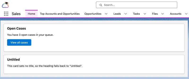
Both cards on the page are the same panel component, and only the slot content differs. The first card passes a title, so “Open Cases” fills the named title slot and shows in the card header, while the paragraph and button carry no slot attribute and drop into the default slot to fill the body. The second card passes only body content, so its header falls back to the “Untitled” placeholder. The container draws the same card chrome both times; the slots are the only thing that changes, which is composition by markup in a single picture.
You have now seen each mechanism on its own. Which one to use comes down to where the two components sit relative to each other, and a good rule of thumb is to pick the most local option that does the job. The table runs from most local at the top to most far-reaching at the bottom:
| Communication need | Use |
|---|---|
| Parent to child (data) | @api property (or an @api method to trigger an action) |
| Parent to child (markup or layout) | <slot>, named or default |
| Child to parent | CustomEvent |
| Siblings under the same parent | Lift the state to the parent |
| Unrelated components, or across Aura/Visualforce | Lightning Message Service |
A few rows are worth a word on their own:
When two components share a page but not an ancestor, or one of them is Aura or Visualforce, Lightning Message Service (LMS) is the sanctioned channel. It works within Lightning Experience, so a Visualforce page can join in only when it is embedded in a Lightning page, not when it runs on its own in Salesforce Classic. You define a message channel, which is a named shared channel described in metadata, then components publish and subscribe to it. There are three moving parts: the channel itself, a publisher, and one or more subscribers.
The channel is a small piece of metadata you create once. It is a LightningMessageChannel file that names the channel and, optionally, declares the fields a message carries. It holds no logic; it is just a named contract that publishers and subscribers agree on:
<?xml version="1.0" encoding="UTF-8"?><LightningMessageChannel xmlns="http://soap.sforce.com/2006/04/metadata"> <description>Broadcasts the Id of the currently selected record.</description> <isExposed>true</isExposed> <lightningMessageFields> <fieldName>recordId</fieldName> </lightningMessageFields> <masterLabel>RecordSelected</masterLabel></LightningMessageChannel>Once you have created the channel, every component that imports it is publishing or listening on the same line. A message is just the payload object a publisher hands to publish; there is nothing else to define. Setting isExposed to true lets components in other namespaces, and in Aura or Visualforce, use the channel too.
Both the publisher and the subscriber start by wiring a MessageContext, the context object LMS needs before it will let a component publish or subscribe. The publisher then calls publish with three things: that context, the channel, and a payload. Here it publishes whenever the user selects a record:
import { LightningElement, wire } from 'lwc';import { publish, MessageContext } from 'lightning/messageService';import RECORD_SELECTED from '@salesforce/messageChannel/RecordSelected__c';
export default class RecordList extends LightningElement {    @wire(MessageContext) messageContext;
    handleSelect(event) {        publish(this.messageContext, RECORD_SELECTED, { recordId: event.detail.id });    }}
The subscriber wires the same MessageContext, then calls subscribe in connectedCallback (the lifecycle hook that runs when the component is added to the page), passing the context, the channel, and a listener function. That listener runs every time a message is published on the channel, receiving the payload, so here it reads recordId and stores it for the template to use. subscribe returns a subscription, which the component keeps and passes to unsubscribe in disconnectedCallback (the matching hook that runs when the component is removed). These two hooks are the component’s setup and cleanup points, and the next section unpacks them:
import { LightningElement, wire } from 'lwc';import { subscribe, unsubscribe, MessageContext } from 'lightning/messageService';import RECORD_SELECTED from '@salesforce/messageChannel/RecordSelected__c';
export default class RecordDetail extends LightningElement {    @wire(MessageContext) messageContext;    subscription;    selectedRecordId;
    connectedCallback() {        this.subscription = subscribe(            this.messageContext,            RECORD_SELECTED,            (message) => { this.selectedRecordId = message.recordId; }        );    }
    disconnectedCallback() {        unsubscribe(this.subscription);        this.subscription = null;    }}
Explicitly unsubscribing is useful when a component must stop listening before it is destroyed, and it makes the lifecycle visible in this example. When you use a wired MessageContext, Lightning Message Service also unregisters the subscription when the component is destroyed. Service modules that create a message context themselves must release that context manually.
This is a good point to stop reading and build these patterns yourself. The Communicate Between Lightning Web Components Trailhead Project works through all three in the same order as this section.
A lifecycle hook is a callback method that runs at a specific phase in a component’s lifecycle. In practice, that means LWC gives you named points to run code when the framework creates an instance of your component at runtime, inserts it into the DOM, re-renders it, or removes it again.
| Hook | When it runs | Use for |
|---|---|---|
constructor() |
Component instance created | Minimal setup only, such as default values. Call super() first, and do not expect DOM access or @api values here. |
connectedCallback() |
Component inserted into the DOM | Startup work that depends on the component being live, such as subscribing to LMS, adding listeners, building caches, or kicking off an imperative load. |
renderedCallback() |
Component finishes rendering, including re-renders | DOM dependent work, such as measuring elements or setting focus, with a guard so the same code does not run on every re-render. |
disconnectedCallback() |
Component removed from the DOM | Cleanup for anything set up earlier, such as unsubscribing, removing listeners, clearing timers, or releasing cached state. |
errorCallback(error, stack) |
A child component throws an error | Error boundary handling, so the parent can log the failure and switch to a fallback UI instead of letting the whole region fail. |
Ordering matters more than people expect: connectedCallback runs parent first (children do not exist in the DOM yet), while renderedCallback runs child first. And connectedCallback is not “once per lifetime”. Remove a component from the DOM and reinsert it, such as after a tab switch or a conditional template, and it fires again, which is why its cleanup twin disconnectedCallback must undo whatever it set up.
The hook that enables graceful error handling in production is errorCallback. It is LWC’s error boundary, something Aura never had, and it turns “a child component threw and the whole region died” into a graceful fallback:
errorCallback(error, stack) { this.renderFailed = true; // template switches to a fallback message console.error('Child component failed', error, stack);}The hook that can cause the most subtle production incidents is renderedCallback. It runs after every render, so any unguarded state assignment inside it schedules another render, which runs it again.
In real code, I usually treat renderedCallback as “DOM-only, one-time”:
renderedCallback() { if (!this.hasInitializedDom) { this.hasInitializedDom = true; // only DOM work here: focus, measure, init external widgets }}Anything that changes state (Apex calls, property updates, event subscriptions) goes outside this hook, or into connectedCallback with its own guard.
Hardcoded URLs break across environments, container types, and releases. The lightning/navigation module abstracts the destination into a PageReference, a plain object that describes where the user should go, and lets the platform work out the URL:
import { LightningElement, api } from 'lwc';import { NavigationMixin } from 'lightning/navigation';
export default class AccountLink extends NavigationMixin(LightningElement) {    @api recordId;
    handleOpenRecord() {        this[NavigationMixin.Navigate]({            type: 'standard__recordPage',            attributes: {                recordId: this.recordId,                objectApiName: 'Account',                actionName: 'view'            }        });    }}
Two things in that code are worth explaining. NavigationMixin is a function, not a class: you call it with LightningElement, and it returns a new class that extends LightningElement with the navigation methods added on top. Your component extends that returned class, which is why the line reads NavigationMixin(LightningElement) rather than plain LightningElement. Those added methods are called through bracket notation, this[NavigationMixin.Navigate](...), which is simply how the mixin exposes them. The object you pass is the PageReference: a type that names the kind of destination, plus the attributes that type needs.
The PageReference types you will use most:
| Type | Destination |
|---|---|
standard__recordPage |
A record’s view or edit page |
standard__objectPage |
An object home or list view (filterName in state) |
standard__navItemPage |
A custom tab |
standard__webPage |
An external URL |
standard__component |
A lightning__UrlAddressable LWC |
Two related tools round this out:
this[NavigationMixin.GenerateUrl](pageReference) hands you the actual URL (as a promise) instead of navigating straight away. Use it when you want a real <a href> link rather than a button with a click handler. A real link is better for accessibility and lets people middle-click to open it in a new tab.CurrentPageReference wire adapter works the other way round: it tells a component where it currently is. It reads the current page’s reference and any state on the URL, including the c__ parameters passed to a URL-addressable component.To see it on a page, build a small navDemo component: a card of buttons that each go somewhere different, so you can watch NavigationMixin resolve a PageReference into a real destination without a single hardcoded URL.
navDemo, and replace its files with the code below.sf project deploy start --source-dir force-app/main/default/lwc/navDemo.<template> <lightning-card title="Quick Links"> <div class="slds-p-horizontal_medium slds-p-bottom_medium"> <lightning-button label="New Account" onclick={goToNewAccount} class="slds-m-right_x-small"></lightning-button> <lightning-button label="All Accounts" onclick={goToAccountList} class="slds-m-right_x-small"></lightning-button> <lightning-button label="Salesforce Docs" onclick={goToDocs}></lightning-button> </div> </lightning-card></template>import { LightningElement } from 'lwc';import { NavigationMixin } from 'lightning/navigation';
export default class NavDemo extends NavigationMixin(LightningElement) { goToNewAccount() { this[NavigationMixin.Navigate]({ type: 'standard__objectPage', attributes: { objectApiName: 'Account', actionName: 'new' } }); }
goToAccountList() { this[NavigationMixin.Navigate]({ type: 'standard__objectPage', attributes: { objectApiName: 'Account', actionName: 'list' }, state: { filterName: 'Recent' } }); }
goToDocs() { this[NavigationMixin.Navigate]({ type: 'standard__webPage', attributes: { url: 'https://developer.salesforce.com/docs/platform/lwc/guide' } }); }}<?xml version="1.0" encoding="UTF-8"?><LightningComponentBundle xmlns="http://soap.sforce.com/2006/04/metadata"> <apiVersion>67.0</apiVersion> <isExposed>true</isExposed> <targets> <target>lightning__AppPage</target> <target>lightning__HomePage</target> <target>lightning__RecordPage</target> </targets></LightningComponentBundle>
Shadow DOM is a browser standard that gives each component its own private piece of the page, keeping its markup and styles separate from everything around it. That is why each component’s CSS is sealed off: your styles affect only your own markup, page styles cannot leak in, and (the part that surprises people) your CSS cannot reach into child components, including base components. That last rule is not an obstacle to get around with clever selectors; it is that isolation working as intended. Work with it instead, using the three styling tools the platform supports:
slds-p-around_medium, slds-grid), exactly as in the Aura guide.:host styling the component’s root element.:host { /* restyle the brand button inside this component only */ --slds-c-button-brand-color-background: #2e844a; --slds-c-button-brand-color-border: #2e844a;}There is an apparent contradiction here: your CSS cannot reach into a base component, yet this clearly restyles one. Styling hooks are the sanctioned exception. CSS custom properties, unlike ordinary selectors, inherit through the shadow boundary, so a value you set on :host flows down into the base component, whose own styles then use it. You are not reaching into its internals; you are handing it a value it was built to accept. The hooks each base component supports are listed on its Component Reference page.
One historical quirk you could meet in real orgs: for years LWC ran a synthetic version of shadow DOM rather than the browser’s native one, and it was leakier, so global SLDS styles reached inside components and some teams’ CSS ended up relying on that. Salesforce is moving to native shadow so write CSS that assumes full encapsulation (your own utility classes, styling hooks for children), and your components will not care which mode they run under.
| Situation | Preferred approach | Why |
|---|---|---|
| Spacing, alignment, layout | SLDS utility classes | Fast, consistent, upgrade friendly |
| Common inputs and buttons | Base lightning-* components |
Built-in accessibility and platform styling |
| One-off component visuals | Local component CSS | Scoped, no side effects |
| Customising base components | Styling hooks | The supported boundary crossing mechanism |
You have used SLDS classes throughout this guide without a proper introduction, so here is one. The Salesforce Lightning Design System (SLDS) is the platform’s own design language: the same tokens, spacing, and component styles Salesforce uses to build Lightning itself. Leaning on it is why your components look native without you writing much CSS. Two things are worth bookmarking on day one: the utility classes (spacing such as slds-m-around_medium, layout such as slds-grid and slds-col, plus typography and colour) and the styling hooks each base component publishes. New developers lose the most time simply not knowing a class already exists, so when you reach for custom CSS, check the reference first.
Everything above assumes shadow DOM, which is the right default and what you should reach for almost every time. Occasionally you genuinely cannot live with the boundary: a third-party library that needs to query the DOM across components, or a global stylesheet that has to reach inside. For those cases LWC offers light DOM, an opt-out where your component renders into the regular page DOM instead of a shadow root. You enable it per component with a static renderMode = 'light' field in the class and the <template lwc:render-mode="light"> directive on the root template.
The trade-off is the whole point: light DOM gives up the encapsulation shadow DOM gave you for free. Your styles can now leak out and the page’s styles can leak in, so you contain them with scoped styles (a *.scoped.css file), and you query with this.querySelector rather than this.template.querySelector. Treat it as a deliberate exception for a specific integration need, not a default, and keep the rest of your components in shadow DOM.
Accessibility is something you design in from the start, not a box ticked before release. The guidance here is consistent: handling it from the first line of a component is far cheaper and more effective than retrofitting it into finished UI, where it turns into expensive rework. It belongs in how you build a component, the same way security and performance do, not in a cleanup pass at the end. It is still worth being clear about why it matters, because the reasoning is what makes the practice stick.
Around 1.3 billion people, roughly 16% of the world, live with a significant disability. Disability is also not a fixed category you either design for or do not: it can be permanent (a person who is blind), temporary (recovering from eye surgery), or situational (bright sunlight on a phone screen, or holding a baby on a noisy ward). Build for the first group and you help all three, the same way the kerb cuts made for wheelchairs ended up helping prams, trolleys, and tired travellers. Accessible UI is simply better UI for everyone.
In the industries Salesforce runs in, the stakes go well beyond convenience. When a patient portal, a benefits application, or a banking flow is built from components a screen reader cannot operate, real people are shut out of care, money, and services they are entitled to. The healthcare picture is sobering: reports find that many patients with disabilities cannot complete basic tasks such as booking an appointment or reading their own lab results online. Someone who cannot use the portal can miss a result that matters. That is an equity problem before it is a technical one, and it is exactly the kind of system Salesforce powers through Health Cloud and Experience Cloud.
It is also the standard, and increasingly the law. The benchmark is the Web Content Accessibility Guidelines (WCAG) from the W3C, and most teams target its AA conformance level. The European Accessibility Act began enforcement in June 2025, the US ADA is regularly read to require accessible web experiences, and healthcare and government carry their own mandates on top. Salesforce itself targets WCAG AA and publishes accessibility conformance reports for its products. Treating accessibility as optional is, more and more, a compliance risk as well as the wrong thing to do.
WCAG rests on four principles, easiest to remember as POUR. A user interface should be Perceivable (people can take the information in, whether by sight, sound, or touch), Operable (they can drive it, including by keyboard alone), Understandable (it behaves predictably and explains itself), and Robust (it works with assistive technology, today and as that technology changes). Everything below is just POUR applied to LWC.
The good news: base components carry most of the load. lightning-input wires its own label association, lightning-button is a real button, and focus and ARIA behaviour come built in. Most LWC accessibility failures happen where developers step outside base components: a clickable div instead of a button, a custom dropdown with no keyboard support, or an icon button with no accessible name.
Working rules:
variant="label-hidden" (the label is still announced) rather than omitting the label.aria-live region where it matters.| Check | What to verify | Common failure mode |
|---|---|---|
| Keyboard navigation | Tab reaches every control in a logical order | Click handlers on divs that keyboards cannot reach |
| Input labelling | Every input has a programmatic label | Placeholder text doing a label’s job |
| Error feedback | Errors are visible and announced | Error conveyed only by colour |
| Dynamic updates | State changes are perceivable to assistive tech | Results replace silently; focus is lost on re-render |
For dynamic UI, test the happy path and the failure path with the keyboard only, then again with a screen reader. A component that passes every check done with a mouse can still be completely unusable with assistive technology.
Security in LWC is a shared responsibility: Salesforce secures the platform, and you secure what you build on top of it. That second half is where most real incidents start. The data in a Salesforce org, patient records, financial accounts, citizen case files, is exactly what attackers want and regulators protect, so a component that leaks it or runs untrusted script is never a small bug.
Two principles from general security practice carry most of the weight. Least privilege means a user can see and do only what their role entitles them to, and nothing more. Defence in depth means never trusting a single check, because layers catch what any one check misses. They line up with the wider industry: the OWASP Top 10 puts broken access control and injection (which includes cross-site scripting) at the top of web application risks, and LWC security is largely those two with a Salesforce accent, access control on the server and script injection on the client.
That gives the section its shape. LWC security has two sides, with a rule of thumb for each: the client side is mostly handled for you, and the server side is mostly yours. In other words, the platform’s own protections cover most risks in the browser automatically, while deciding who is allowed to see which data is work only your code can do.
On the client, your JavaScript runs inside a browser-level security sandbox that isolates components from each other and from the rest of the page. This kind of sandbox is a browser security boundary, not a Salesforce org sandbox; the two share a name and nothing else. Orgs created from Winter ’23 onward have Lightning Web Security (LWS) enabled by default; older orgs may still run the earlier Lightning Locker, so check which is active rather than assuming. LWS virtualises the globals your code touches so components from different namespaces cannot interfere with each other, and it is far more compatible with standard JavaScript and third-party libraries than Locker was. Salesforce is gradually enabling LWS everywhere, so new code should assume it. You mostly will not notice the sandbox day to day, until you reach outside it, which is where the rules live:
loadScript/loadStyle from lightning/platformResourceLoader, not from external CDNs; the Content Security Policy will block remote script loads, and pinned, reviewed library versions are the point.lwc:dom="manual" with innerHTML. LWC templates escape everything they render, which is what stops user input from running as script (an XSS attack); writing to the DOM by hand throws that protection away and makes sanitising the input your job. Use the template instead wherever you can.The sandbox protects the page. It does nothing to decide which records a user is allowed to see, and that decision is the half that is yours. Stay on the base components and wire adapters from earlier and Lightning Data Service respects the running user’s field-level security and sharing for you, which is one more reason to reach for Apex last. The moment you do write your own Apex, that enforcement becomes your job. The same Apex serves LWC and Aura, so the rules are identical, and how much you get for free depends on the API version of the class.
From the Summer ’26 release, classes compiled at API version 67.0 or later run database operations in user mode by default, so SOQL and DML respect the running user’s object permissions, field-level security, and sharing automatically. Classes on older API versions still default to system mode, which enforces none of that for you. Because a real org runs classes on many API versions at once, the safe habit is to be explicit rather than trust the default:
public with sharing class SecureLwcController { @AuraEnabled(cacheable=true) public static List<Contact> loadContacts(Id accountId) { return [ SELECT Id, Name, Email FROM Contact WHERE AccountId = :accountId WITH USER_MODE ORDER BY Name LIMIT 50 ]; }}Three things are doing the work here, and they are not interchangeable. with sharing applies record-level visibility, which rows the user is allowed to see. WITH USER_MODE enforces object and field permissions at query time, which objects and fields they can read. And the bind variable :accountId rules out SOQL injection. You want all three, because each closes a gap the others leave open, which is defence in depth inside a single query. (WITH USER_MODE also replaces the older WITH SECURITY_ENFORCED, which is removed from API version 67.0 onward.) The Aura guide’s security section breaks each of these down line by line, and every word applies to Apex called from LWC.
I’ve lost count of the times I have seen a component work as admin but break under a real user’s profile. Usually it is the same thing: Apex running in system mode, a missing with sharing, or a field the user could not see. It looked fine in testing, then failed in production for a real person. Now I always check against a real business user’s profile before I call a component done.
On this platform, slow pages are often caused by trips to the server and the amount of data pulled across them, not rendering alone. The LWC engine already updates only the part of the page that changed, and Lightning Data Service already keeps one cached copy of a record and shares it with every component that asks, so the expensive defaults are working in your favour before you touch anything. Salesforce even puts a number on the result: Experience Page Time (EPT), the time until a page is genuinely usable, which you can watch per page in the Lightning Usage App. Salesforce’s DreamHouse case study reported EPT gains ranging from 2.4% to 63% across the migrated pages. Treat that as one case study rather than a promise for every org, but it shows why LWC is the right default for new Lightning UI work.
That gives this section the same shape as security: the framework keeps the rendering fast, and you must keep the data cheap. Most performance work is just not squandering the good defaults, and the biggest lever by far is how much you ask of the server, so start there:
LIMIT on your queries, and never “fetch everything and filter in JavaScript”. Avoid pulling a record by layout unless you genuinely need all of it: a layout can carry hundreds of fields, and the metadata that rides along with it dwarfs the data you were actually after.cacheable=true so repeat calls come from the cache rather than the server (and own the refresh story, per the Apex section).handleSearchChange(event) { window.clearTimeout(this.delayTimeout); const value = event.target.value; this.delayTimeout = window.setTimeout(() => { this.searchTerm = value; // reactive wire param updates after 300ms of quiet }, 300);}That is the data side. The rendering side is the smaller lever, but it is easy to waste:
keys in lists, and build expensive subtrees only when they are on screen. lwc:if removes a branch from the DOM entirely, so a closed tab does not need its datatable built.renderedCallback. It fires after every render, far more often than most people expect, which makes it an easy place to bury repeated work.Tests are what let you change a component months from now without holding your breath. In the Aura era, this usually meant browser automation or awkward integration-style testing, so many teams tested less at the component level. LWC fixes that. Its unit tests are ordinary Jest tests that run locally in Node against a simulated DOM (jsdom), without needing an org or a deployment, so they are fast enough to run continuously while you work. The tooling is @salesforce/sfdx-lwc-jest. Standard Salesforce DX templates commonly include the dependency and npm run test:unit scripts, but check your project’s package.json rather than assuming they are present.
A Jest test earns its place by proving the things you would otherwise verify by hand every time you touched the component: that it renders the right output, reacts to input, raises the events it promises, and copes with the states real data puts it in. It is one layer of a larger picture. Jest proves the component behaves; Apex tests prove the server logic is correct and secure; and a thin layer of tests that drive the critical journeys end to end ties the two together. They complement each other rather than competing, and the Jest layer is the cheapest and fastest to write, so it is where most of your everyday UI confidence should come from.
Test files live in a __tests__ folder inside the bundle, named <component>.test.js. They stay in source control and never deploy to the org, which is part of why they can be plentiful and fast.
Every test follows the same arc: build the component, put it on the page, interact with it, let the DOM catch up, then check what changed. The capstone’s contactTile is a good first subject, because it has one job: show a contact and raise an event when its button is clicked.
import { createElement } from 'lwc';import ContactTile from 'c/contactTile';
const CONTACT = { id: '003000000000001', name: 'Ada Lovelace', title: 'CTO' };
describe('c-contact-tile', () => {    afterEach(() => {        // jsdom keeps one document per test file, so reset it between tests        while (document.body.firstChild) {            document.body.removeChild(document.body.firstChild);        }    });
    it('renders the contact name', () => {        // build the component with a contact and put it on the page        const element = createElement('c-contact-tile', { is: ContactTile });        element.contact = CONTACT;        document.body.appendChild(element);
        // check what rendered        const heading = element.shadowRoot.querySelector('.slds-text-heading_small');        expect(heading.textContent).toBe('Ada Lovelace');    });
    it('dispatches contactselect with the id and name when Select is clicked', () => {        const element = createElement('c-contact-tile', { is: ContactTile });        element.contact = CONTACT;        document.body.appendChild(element);
        // listen for the event, then click Select to trigger it        const handler = jest.fn();        element.addEventListener('contactselect', handler);        element.shadowRoot.querySelector('lightning-button').click();
        // it should have fired once, carrying the contact's id and name        expect(handler).toHaveBeenCalledTimes(1);        expect(handler.mock.calls[0][0].detail).toEqual({ id: CONTACT.id, name: CONTACT.name });    });});
A few details in that test are doing deliberate work:
createElement exists only in tests. It is how a test instantiates a component; never import it into component code.element.contact before appendChild is intentional. The component uses that value during its initial render, so the assertions can run without waiting for another update.element.shadowRoot lets the test inspect the component’s rendered DOM. It reaches across the shadow boundary that normally keeps a component’s internals private.jest.fn() as the listener, then confirms it fired once with the right detail. That is the round trip from child to parent from earlier, verified rather than assumed.A unit test should exercise one component on its own, so the server has to be faked. There are three cases, and the data ladder roughly predicts how often you will meet each.
Imperative Apex is the simplest: mock the method’s module with a plain Jest mock function, then tell it what to return or throw.
import searchAccounts from '@salesforce/apex/AccountSearchController.searchAccounts';
jest.mock(    '@salesforce/apex/AccountSearchController.searchAccounts',    () => ({ default: jest.fn() }),    { virtual: true });
// inside a test:searchAccounts.mockResolvedValue([{ Id: '001000000000001', Name: 'Acme' }]); // successsearchAccounts.mockRejectedValue(new Error('Server unavailable'));            // failure
LDS wire adapters are the case you will hit most, because the guide steers you toward them, and sfdx-lwc-jest already ships test versions of the standard ones. Import the same adapter your component wires and drive it directly: emit() pushes a successful result into the wire and error() pushes a failure, so every state the wire can produce is reachable on demand. No jest.mock is needed. Emit a fixture shaped like the adapter’s real response, which for LDS adapters is usually kept in a JSON file beside the test.
import { getRecord } from 'lightning/uiRecordApi';
// a fixture shaped like the UI API getRecord response, kept beside the testconst mockRecord = require('./data/getRecord.json');
// inside a test, once the element is on the page:getRecord.emit(mockRecord); // wire delivers datagetRecord.error();          // wire delivers an error
Wired Apex (a cacheable method behind @wire) is not auto-mocked, so you register a test adapter for it. Jest hoists the mock factory above your imports, so build the adapter inside the factory with require rather than a top-level import, then drive it with the same emit() and error().
import getContacts from '@salesforce/apex/ContactController.getContacts';
jest.mock(    '@salesforce/apex/ContactController.getContacts',    () => {        const { createApexTestWireAdapter } = require('@salesforce/sfdx-lwc-jest');        return { default: createApexTestWireAdapter(jest.fn()) };    },    { virtual: true });
// inside a test:getContacts.emit([{ Id: '003000000000001', Name: 'Ada Lovelace' }]); // wire delivers datagetContacts.error();                                                 // wire delivers an error
After an emit, the component usually updates asynchronously, so wait for the microtask queue to settle before asserting on the new DOM (see What to Test). These same controls are how you reach each UI state in a test: before the first emit is the loading state, an empty result is the empty state, error() is the error path, and data is success.
Aim tests at what the component promises to the outside world: its rendered output, its public @api properties and methods, the interactions it responds to, and the events it raises. Leave the private internals alone. Testing them adds upkeep without adding confidence, and it pins the implementation in place, so you cannot refactor freely without rewriting tests that were never really about behaviour.
Two practical notes keep these tests honest:
await Promise.resolve(), or a small flushPromises helper when several promises chain, before asserting on the new output.lightning-button, lightning-datatable and the rest render as lightweight placeholders, not the real components. Test your own component’s behaviour around them, not their internals, which belong to Salesforce.Most LWC bugs feel mysterious for about a minute, until you remember that a component is a stack of distinct layers and a given symptom almost always points at one of them. The bundle section put it this way: display problems live in the template, behaviour lives in the class, “I cannot add it to my page” problems live in js-meta.xml, and missing data lives in the wire, the Apex, or the running user’s permissions. Troubleshooting is mostly the discipline of naming the layer before you change any code, then reaching for the tool that can actually see into it.
So start from the symptom and let it point you at the layer:
| Symptom | First place to check |
|---|---|
| Component not visible in App Builder | js-meta.xml: isExposed and targets |
recordId is undefined |
Component is actually on a record page, @api recordId declared, lightning__RecordPage targeted |
| Wire shows no data and no error | Both are undefined while loading, so handle the pending state |
| Data never updates after a change | Cacheable Apex without refreshApex; LDS not notified of external changes |
| Browser tab freezes or runs hot | Unguarded state change in renderedCallback() |
| Apex call fails | Method access for the profile, parameter name mismatch, unhandled exception |
| One child component error blanks the whole tree | Add an errorCallback boundary in a parent to contain it |
Console logs show unreadable Proxy objects |
Enable custom formatters, or log JSON.parse(JSON.stringify(value)) |
| External library fails to load | CSP/LWS: load from a static resource, check Trusted URLs |
| Event never reaches the parent | Name mismatch (onfoo vs dispatched foo), or expecting it to cross a shadow boundary |
From there, work in layers from the outside in: the browser console first, then the network tab for what was actually requested and returned, then the Apex debug logs for the server side, and finally the component’s metadata and the user’s permissions. That last part is worth internalising, because most “code bugs” filed against a component that clearly used to work turn out to live in those final two layers, not in the JavaScript at all.
Before you open DevTools in earnest, turn on Debug Mode (Setup → Debug Mode, enabled per user). With it off, the framework is minified and your stack traces are close to useless. With it on, the code loads in readable form, breakpoints land where you expect, and the LWC engine prints runtime warnings that name the exact component and property involved instead of giving you a minified shrug. It is the single most useful thing you can do before debugging anything on the client. Turn it back off when you are finished, because it slows pages down enough to matter (the Performance section covers that cost).
The browser’s own DevTools are where most bugs on the client get solved, and LWC is tuned to work with them. A few settings earn their keep:
Proxy objects, which is why logging one shows an opaque wrapper rather than your values. Custom formatters teach DevTools to display the real values inline, so you stop logging a JSON.parse(JSON.stringify(...)) copy every time you want to read something.
When the browser shows a clean request but a failed or empty response, the problem has moved to the server. Open the Apex debug logs (in the Developer Console, or Setup → Debug Logs) to see what the method actually did. For anything trickier than a stray log line, the Apex Replay Debugger in the Salesforce Extension Pack for VS Code replays a debug log so you can step through the Apex line by line, inspect variables, and follow the call stack, with no special licence required.
The layer people check last is the one most often at fault, and it is the same access model the security section was about: a method the running user’s profile cannot reach, a field hidden by field-level security, or a record that sharing never granted. A component can be flawless and still show nothing because the user was never allowed to see the data. So when something “works for me” but not for a user, check their permissions before you touch the code.
You will rarely start on a blank org. Most have years of Aura, and often Visualforce, already in place, so a new LWC usually has to work alongside the older frameworks, frequently on the very same page. The boundary between them is well defined, but one of its rules is the opposite of what people expect.
@api properties and can call its @api methods, and it listens for the child’s events with the same on prefix LWC uses: a contactselect event is handled by oncontactselect and read from event.detail. The naming discipline from earlier (lowercase, no hyphens, no on baked into the name) matters across this boundary too.@api properties or events. Lightning Message Service is the shared bus that reaches all three frameworks.Keep new custom UI in LWC by default, and treat every remaining Aura wrapper as a question with an expiry date. Targets such as lightning__UrlAddressable and LWC quick actions have removed most of the reasons that once justified building a new Aura shell. When you are ready to retire one, Salesforce’s migration guide and the Aura article’s migration section cover the mapping.
A component that works in your sandbox, on your admin profile, against a handful of tidy records, is not yet a component ready for production. The gap is most of what this guide has been about: real users with restricted permissions, real data with missing or awkward values, and real pages that have to stay fast and usable for everyone. Before you ship an LWC, walk this list. Each item links back to where the guide covers it, in case you want to refresh.
PageReference, with no hardcoded URLs?This capstone brings the guide’s threads together: record context, the data-access ladder (no Apex required), parent-child composition, a custom event, the four UI states, scoped styling that does not leak, and Jest tests. You will build a two-component feature for an Account record page: the parent loads the account’s contacts and renders one child tile per contact; clicking a tile’s button raises an event the parent handles.
Account record page└── c-account-contact-explorer (parent: exposed to lightning__RecordPage) ├── @wire getRecord → Account name for the card title ├── @wire getRelatedListRecords → the account's Contacts, no Apex ├── states → loading / error / empty / list └── c-contact-tile (× n) (child: not exposed) ├── scoped CSS → custom styling stays inside the tile └── dispatches 'contactselect' → parent updates the selection linecontactTile)Let’s start with the child. Create its bundle with SFDX: Create Lightning Web Component: choose JavaScript, name it contactTile, and output it to force-app/main/default/lwc. Then copy the code below into the bundle. One thing the command does not do is create the CSS file, so add contactTile.css to the bundle folder yourself; LWC automatically applies any stylesheet that shares the bundle’s name. The tile receives a plain contact object and raises an event when someone selects it. Leave isExposed as false, because this is an internal building block, not something an admin should be able to drag onto a page.
<template> <div class="slds-box slds-box_small slds-m-bottom_x-small slds-grid slds-grid_align-spread slds-grid_vertical-align-center"> <div> <p class="slds-text-heading_small">{contact.name}</p> <p class="slds-text-body_small slds-text-color_weak">{contact.title}</p> </div> <lightning-button label="Select" onclick={handleSelect}></lightning-button> </div></template>import { LightningElement, api } from 'lwc';
export default class ContactTile extends LightningElement { @api contact;
handleSelect() { this.dispatchEvent(new CustomEvent('contactselect', { detail: { id: this.contact.id, name: this.contact.name } })); }}:host { display: block; border-left: 3px solid #0176d3; /* a visible accent on every tile */ border-radius: 0.25rem;}
p { /* a deliberately broad selector: on a normal page this would highlight every paragraph, but it only ever reaches this component's own <p> */ background-color: #aacbff; padding: 0.1rem 0.35rem; border-radius: 0.2rem;}<?xml version="1.0" encoding="UTF-8"?><LightningComponentBundle xmlns="http://soap.sforce.com/2006/04/metadata"> <apiVersion>67.0</apiVersion> <isExposed>false</isExposed></LightningComponentBundle>That stylesheet is worth a closer look, because it makes the encapsulation from the styling section something you can actually see. The :host rule gives every tile a blue accent, and the p rule is deliberately broad: a bare element selector that drops a light-blue highlight behind the tile’s paragraphs. On an ordinary page a rule like that would tint every <p> in sight. Once it is deployed, look at where the highlight lands: the name and title inside each tile sit on it, but the parent’s own paragraphs (the “Selected contact” line and the empty-state message) stay plain white. That visible difference is the whole point: the tile’s CSS never reaches the parent, because each bundle’s styles are sealed inside its own shadow root. You get to write simple, local selectors without worrying about the rest of the page.
accountContactExplorer)Now the parent. Create a second bundle the same way (SFDX: Create Lightning Web Component, JavaScript, name it accountContactExplorer, output to force-app/main/default/lwc), then copy the code below into it. This one has only the three generated files, so there is no extra CSS to add. The parent wires the account name and the related contacts, maps the nested record shape that Salesforce’s UI API returns into the simple objects the tile expects, and handles the child’s event.
<template>    <lightning-card title={cardTitle} icon-name="standard:contact">        <div class="slds-p-around_medium">            <template lwc:if={isLoading}>                <lightning-spinner alternative-text="Loading contacts" size="small"></lightning-spinner>            </template>            <template lwc:elseif={hasError}>                <p class="slds-text-color_error">Could not load contacts. Refresh the page or contact your admin.</p>            </template>            <template lwc:elseif={hasContacts}>                <template for:each={contacts} for:item="contact">                    <c-contact-tile                        key={contact.id}                        contact={contact}                        oncontactselect={handleContactSelect}>                    </c-contact-tile>                </template>            </template>            <template lwc:else>                <p>No contacts on this account yet.</p>            </template>
<template lwc:if={selectedName}> <p class="slds-m-top_medium">Selected contact: <strong>{selectedName}</strong></p> </template> </div> </lightning-card></template>import { LightningElement, api, wire } from 'lwc';import { getRecord, getFieldValue } from 'lightning/uiRecordApi';import { getRelatedListRecords } from 'lightning/uiRelatedListApi';import ACCOUNT_NAME from '@salesforce/schema/Account.Name';
export default class AccountContactExplorer extends LightningElement { @api recordId; selectedName;
@wire(getRecord, { recordId: '$recordId', fields: [ACCOUNT_NAME] }) account;
@wire(getRelatedListRecords, { parentRecordId: '$recordId', relatedListId: 'Contacts', fields: ['Contact.Id', 'Contact.Name', 'Contact.Title'], sortBy: ['Contact.Name'] }) contactsResult;
get cardTitle() { const name = getFieldValue(this.account?.data, ACCOUNT_NAME); return name ? `Contacts for ${name}` : 'Contacts'; }
get isLoading() { return !this.contactsResult?.data && !this.contactsResult?.error; }
get hasError() { return Boolean(this.contactsResult?.error); }
get contacts() { return (this.contactsResult?.data?.records ?? []).map((record) => ({ id: record.fields.Id.value, name: record.fields.Name.value, title: record.fields.Title.value })); }
get hasContacts() { return this.contacts.length > 0; }
handleContactSelect(event) { this.selectedName = event.detail.name; }}<?xml version="1.0" encoding="UTF-8"?><LightningComponentBundle xmlns="http://soap.sforce.com/2006/04/metadata"> <apiVersion>67.0</apiVersion> <isExposed>true</isExposed> <masterLabel>Account Contact Explorer</masterLabel> <description>Lists the account's contacts and lets the user select one.</description> <targets> <target>lightning__RecordPage</target> </targets> <targetConfigs> <targetConfig targets="lightning__RecordPage"> <objects> <object>Account</object> </objects> </targetConfig> </targetConfigs></LightningComponentBundle>Worth pausing on what is not here: no Apex class, no test class for a controller, no security review of a query. getRelatedListRecords runs as the user with FLS and sharing enforced, and LDS caches it. The mapping getter turns the UI API’s nested record shape (record.fields.Name.value) into the flat objects the child wants. Keeping that translation in the parent means the tile stays dumb, reusable, and trivial to test.
The child already has a test: the render-and-event example walked through in Testing with Jest is exactly contactTile, so add it as __tests__/contactTile.test.js inside that bundle.
The parent is worth its own test, and it puts the wire mocking from that same section to work on the capstone. This one drives the two LDS adapters with fixtures, then checks that the mapping produced one tile per contact:
import { createElement } from 'lwc';import { getRecord } from 'lightning/uiRecordApi';import { getRelatedListRecords } from 'lightning/uiRelatedListApi';import AccountContactExplorer from 'c/accountContactExplorer';
const ACCOUNT = { fields: { Name: { value: 'Acme Corp' } } };const CONTACTS = {    records: [        { fields: { Id: { value: '003a' }, Name: { value: 'Ada Lovelace' }, Title: { value: 'CTO' } } },        { fields: { Id: { value: '003b' }, Name: { value: 'Alan Turing' }, Title: { value: 'Engineer' } } }    ]};
describe('c-account-contact-explorer', () => {    afterEach(() => {        while (document.body.firstChild) {            document.body.removeChild(document.body.firstChild);        }    });
    it('renders one tile per related contact', async () => {        const element = createElement('c-account-contact-explorer', { is: AccountContactExplorer });        element.recordId = '001xx000003DGb1';        document.body.appendChild(element);
        // drive both LDS wires with fixtures, then let the DOM update        getRecord.emit(ACCOUNT);        getRelatedListRecords.emit(CONTACTS);        await Promise.resolve();
        const tiles = element.shadowRoot.querySelectorAll('c-contact-tile');        expect(tiles).toHaveLength(2);    });});
Emit an empty records array instead and the same test reaches the empty state; call getRelatedListRecords.error() and it reaches the error state.
To run them, first check that @salesforce/sfdx-lwc-jest and the test scripts are listed in package.json. Run npm install to install the declared dependencies, then run npm run test:unit in the integrated terminal for a clear pass or fail summary, no org required. If the dependency or scripts are missing, follow the official LWC testing setup rather than expecting npm install to add them automatically. The Salesforce extension also shows Run Test and Run All Tests links above each describe block when the tooling is configured; the terminal command is the most reliable place to read the actual result.
sf project deploy start --source-dir force-app/main/default/lwc.contactselect, the parent handled it, and a field assignment re-rendered the UI.p rule colours its own paragraphs and never reaches the parent’s.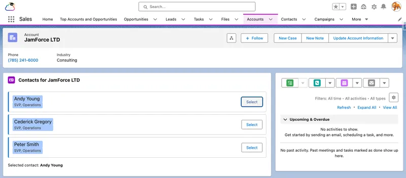

If the component does not appear in App Builder, it is the meta file (isExposed, targets, or the objects restriction). If tiles render but selection does nothing, it is almost always the event name: the child dispatches contactselect, so the parent must bind oncontactselect, and one letter of drift breaks the wiring silently. And if the contact list never loads, check the related list name: relatedListId is the API name (Contacts), not the label shown on the page layout.
This capstone is a production pattern in miniature: record context in, layered data access with no custom server code, explicit UI states, one-way data flow, encapsulated styling, and a tested, reusable child component.
If you worked through Development Fundamentals, your practice org already runs a reimbursement process on the Expense Claim object. Part 5 pays approved claims through a Queueable job with a nightly retry, and Part 6 records a notice from finance when a paid claim comes back. Both builds leave some claims that a person has to look at, and neither gives that person anywhere to look.
This build is that place: a read-only component for a Home or App page that shows which claims need attention and what to do about each one. It also covers the ground the capstone didn’t: the GraphQL wire adapter, navigation, a refresh action, and a permission failure you reproduce on purpose.
Start with what needs to see. The two earlier builds leave claims in three states that need investigation. The nightly sweep can still resolve a potentially stuck claim, so support checks the job history before deciding that someone needs to intervene:
| Queue | Which claims | What it means |
|---|---|---|
| Returned payments | Payment Review with a return reference |
Finance paid the claim, then the money came back, for example because the employee’s bank account had closed. |
| Payment requires review | Payment Review with no return reference |
The payment request failed in a way a retry won’t fix. The stored reason says which: a credential problem, a rejection from finance, or a confirmation the client couldn’t read. |
| Potentially stuck | Approved, no payment reference, unchanged for two days |
Probably missed by both the Queueable and the nightly sweep. Treat it as a hint rather than proof, because any unrelated edit resets the age. |
Now ask the first question from the readiness checklist: is LWC the right tool? A list view can show any one of these queues, and you’ll create three of them below. If support only ever works one queue, a list view is the whole answer and you should stop here.
The component earns its place when support needs all three at once: the count in each queue, the oldest claims, and the next step, on the page they open first. So the two work together. The component shows a short preview of each queue and links to the list view for the rest. The list view handles volume; the component handles triage.
On the data ladder, “filtered, sorted lists without Apex” is the GraphQL rung. getRelatedListRecords from the capstone needs a parent record, and these claims share nothing but their state. A cacheable Apex method would work too, but it would mean a class, a test class, and a security review of the query, all for a read that the platform can already do. One GraphQL request can carry up to ten subqueries, and it runs as the user with field-level security and sharing enforced.
Create the bundle with SFDX: Create Lightning Web Component, name it reimbursementAttention, and replace the javascript with this. The class holds the query and everything the component does with the result; the next section adds the template and metadata that display it.
import { LightningElement, wire } from 'lwc';import { gql, graphql } from 'lightning/graphql';import { NavigationMixin } from 'lightning/navigation';import EXPENSE_CLAIM from '@salesforce/schema/Expense_Claim__c';
const QUEUES = [    {        key: 'returned',        label: 'Returned payments',        listView: 'Returned_Payments',        nextStep: 'Check the employee\'s bank details, then quote the return reference on the claim when you contact finance.'    },    {        key: 'review',        label: 'Payment requires review',        listView: 'Payment_Requires_Review',        nextStep: 'The reason says what failed. Send credential errors to your admin and rejections to finance.'    },    {        key: 'stuck',        label: 'Potentially stuck',        listView: 'Potentially_Stuck_Claims',        nextStep: 'Approved but unpaid for two days. Ask your admin to check Apex Jobs before anyone edits the claim.'    }];
function describeClaim(queueKey, node) {    if (queueKey === 'stuck') {        return `Last changed ${node.LastModifiedDate.displayValue}`;    }    if (!node.Reason) {        // @optional left the field out because this user can't read it        return 'Reason hidden by your access';    }    return node.Reason.value ?? 'No reason recorded';}
export default class ReimbursementAttention extends NavigationMixin(LightningElement) {    queueData;    queueErrors;    refreshQueues;    isRefreshing = false;    refreshFailed = false;
    @wire(graphql, {        query: gql`            query reimbursementAttention {                uiapi {                    query {                        returned: Expense_Claim__c(                            where: {                                and: [                                    { Status__c: { eq: "Payment Review" } }                                    { Reimbursement_Return_Reference__c: { ne: null } }                                ]                            }                            orderBy: { LastModifiedDate: { order: ASC } }                            first: 5                        ) {                            totalCount                            edges {                                node {                                    Id                                    Name { value }                                    Amount: Amount__c { displayValue }                                    Reason: Reimbursement_Error__c @optional { value }                                }                            }                        }                        review: Expense_Claim__c(                            where: {                                and: [                                    { Status__c: { eq: "Payment Review" } }                                    { Reimbursement_Return_Reference__c: { eq: null } }                                ]                            }                            orderBy: { LastModifiedDate: { order: ASC } }                            first: 5                        ) {                            totalCount                            edges {                                node {                                    Id                                    Name { value }                                    Amount: Amount__c { displayValue }                                    Reason: Reimbursement_Error__c @optional { value }                                }                            }                        }                        stuck: Expense_Claim__c(                            where: {                                and: [                                    { Status__c: { eq: "Approved" } }                                    { Reimbursement_Reference__c: { eq: null } }                                    { LastModifiedDate: { lte: { range: { n_days_ago: 2 } } } }                                ]                            }                            orderBy: { LastModifiedDate: { order: ASC } }                            first: 5                        ) {                            totalCount                            edges {                                node {                                    Id                                    Name { value }                                    Amount: Amount__c { displayValue }                                    LastModifiedDate { displayValue }                                }                            }                        }                    }                }            }        `    })    wiredQueues({ data, errors, refresh }) {        this.queueData = data;        this.queueErrors = errors;        this.refreshQueues = refresh;        this.refreshFailed = false;    }
    get isLoading() {        return this.queueData === undefined && this.queueErrors === undefined;    }
    get isBusy() {        return this.isLoading || this.isRefreshing;    }
    get hasError() {        if (this.refreshFailed || this.queueErrors?.length) {            return true;        }        const results = this.queueData?.uiapi?.query;        return this.queueData !== undefined && QUEUES.some((queue) => !results?.[queue.key]);    }
    get queues() {        const results = this.queueData?.uiapi?.query;        if (this.hasError || !results) {            return [];        }        return QUEUES.map((queue) => {            const { totalCount, edges } = results[queue.key];            const claims = edges.map(({ node }) => ({                id: node.Id,                name: node.Name.value,                amount: node.Amount.displayValue,                detail: describeClaim(queue.key, node)            }));            return {                ...queue,                claims,                heading: `${queue.label} (${totalCount})`,                hasClaims: claims.length > 0,                hasMore: totalCount > claims.length,                viewAllLabel: `View all ${totalCount}`            };        });    }
    async handleRefresh() {        if (!this.refreshQueues || this.isRefreshing) {            return;        }        this.isRefreshing = true;        this.refreshFailed = false;        try {            await this.refreshQueues();        } catch {            this.refreshFailed = true;        } finally {            this.isRefreshing = false;        }    }
    handleOpenClaim(event) {        this[NavigationMixin.Navigate]({            type: 'standard__recordPage',            attributes: { recordId: event.currentTarget.dataset.id, actionName: 'view' }        });    }
    handleViewAll(event) {        this[NavigationMixin.Navigate]({            type: 'standard__objectPage',            attributes: { objectApiName: EXPENSE_CLAIM.objectApiName, actionName: 'list' },            state: { filterName: event.currentTarget.dataset.listView }        });    }}
The query is the long part, and most of its length is the same shape three times. These are the details that matter:
returned, review, and stuck each query Expense_Claim__c with a different where filter. The aliases name the results, so the queues getter can look each one up by the same key its QUEUES entry uses.Amount: Amount__c and Reason: Reimbursement_Error__c keep the result’s shape fixed. Salesforce rewrites a GraphQL query when a custom field it references is renamed, and without an alias the rename would change the property names your getter reads.Id is selected on purpose. The rows need it as the template key and as the record to open. GraphQL only returns what you ask for.first: 5 and totalCount. Each queue returns its five oldest claims plus a count of all of them, which is what the “View all 12” link shows. totalCount makes Salesforce look up every matching record rather than just the page, so keep it to queries where the count is part of the job. Here it is.@optional only helps fields you select. If a user can’t read Reimbursement_Error__c, the query still succeeds and that field is simply missing, which describeClaim turns into “Reason hidden by your access”. Filter fields are different. Status__c, both reference fields, and LastModifiedDate decide which queue a claim belongs to, and arguments can’t be optional, so a user who can’t read one of them gets no data at all. You’ll see that happen in the last step.n_days_ago: 2 finds claims last modified two or more days ago. It doesn’t prove the job and the sweep both ran and missed the claim, which is why the queue is called potentially stuck and its next step sends support to Apex Jobs first.The wire goes to a function so the component can keep refresh alongside the data. The GraphQL adapter reports failures in errors rather than error, and the refresh function comes from the same result object.
GraphQL can return data and errors together. Support needs a complete view of all three queues, so this component shows its error state if any query error is present or a queue is missing. It doesn’t render partial results or turn a missing queue into a reassuring zero. The optional reason field is different: omitting that field for a user without access is an expected, successful result.
The template has one loading state and one error state for the whole query, then a section per queue with its own empty message:
<template> <lightning-card title="Reimbursements needing attention" icon-name="standard:currency"> <lightning-button-icon slot="actions" icon-name="utility:refresh" alternative-text="Refresh reimbursement queues" disabled={isBusy} onclick={handleRefresh}> </lightning-button-icon> <div class="slds-p-horizontal_medium"> <template lwc:if={isBusy}> <lightning-spinner alternative-text="Loading reimbursement queues" size="small"></lightning-spinner> </template> <template lwc:elseif={hasError}> <p class="slds-text-color_error" role="alert"> Could not load all reimbursement queues. Try Refresh. If the problem continues, ask your admin to check your access to Expense Claim fields and the query error. </p> </template> <template lwc:else> <template for:each={queues} for:item="queue"> <section key={queue.key} class="slds-m-bottom_medium"> <h3 class="slds-text-heading_small">{queue.heading}</h3> <p class="slds-text-body_small slds-text-color_weak">{queue.nextStep}</p> <template lwc:if={queue.hasClaims}> <ul class="slds-m-top_x-small"> <template for:each={queue.claims} for:item="claim"> <li key={claim.id}> <lightning-button variant="base" label={claim.name} data-id={claim.id} onclick={handleOpenClaim}> </lightning-button> <span class="slds-text-body_small"> · {claim.amount} · {claim.detail}</span> </li> </template> </ul> <template lwc:if={queue.hasMore}> <lightning-button variant="base" label={queue.viewAllLabel} data-list-view={queue.listView} onclick={handleViewAll}> </lightning-button> </template> </template> <template lwc:else> <p class="slds-text-body_small">Nothing to review.</p> </template> </section> </template> </template> </div> </lightning-card></template><?xml version="1.0" encoding="UTF-8"?><LightningComponentBundle xmlns="http://soap.sforce.com/2006/04/metadata"> <apiVersion>67.0</apiVersion> <isExposed>true</isExposed> <masterLabel>Reimbursements Needing Attention</masterLabel> <description>Shows returned, failed, and potentially stuck reimbursements for support.</description> <targets> <target>lightning__HomePage</target> <target>lightning__AppPage</target> </targets></LightningComponentBundle>A few choices in the markup are worth noticing:
lightning-button, so it looks like a link but is reachable with Tab and opens with Enter. The click handler reads the record ID from data-id and navigates with a PageReference, never a hand-built URL.h3 beneath it, so a screen reader user can jump between queues the same way a sighted user scans them.refresh, which re-runs the query. While it waits, the spinner appears and the button is disabled; a rejected refresh shows the error message and leaves the button available to try again. It is the same lesson as the cached Apex story earlier in this guide, with a different adapter.The View all links need somewhere to go. On the Expense Claims tab, create three list views and share them with the users who work these queues. For each view, set Filter by Owner to All Expense Claims, then add the field filters below using AND. That matches the GraphQL query’s scope: all matching claims the current user can read, including claims owned by someone else. Sharing a view makes it available to other users; it doesn’t change its owner filter or grant access to its records.
Use these labels and confirm that each view’s API name matches the listView value in the class:
Returned Payments: Status equals Payment Review, and Reimbursement Return Reference not equal to a blank value.
Payment Requires Review: Status equals Payment Review, and Reimbursement Return Reference equals a blank value.
Potentially Stuck Claims: Status equals Approved, Reimbursement Reference equals a blank value, and Last Modified Date less or equal 2 DAYS AGO.
2 DAYS AGO is a relative date value, and Salesforce supports relative date filters in list views. It refers to a calendar day, not a rolling 48-hour window. Save the filter, then compare the view with the refreshed component as the same user. Include an older claim owned by someone else but shared with that user, and check that it appears in both places. If the results differ, compare the owner filter, field filters, and record access before changing the query.
The mocking section covered LDS and Apex adapters. Salesforce’s GraphQL recipe uses the packaged GraphQL stub’s emit() for data and emitErrors() for failure. Here we also need data and errors in the same response, plus control over when refresh finishes. A local mock built with createTestWireAdapter lets each test emit the whole wire result: { data, errors, refresh }. The fixture inside data still starts at uiapi.
The navigation mock records the requested PageReference, so a test can check the destination without opening another page. Both mocks stay in the test file.
If they don’t already exist, create a __tests__ folder inside the reimbursementAttention bundle, and add a file named reimbursementAttention.test.js. Paste in the code below into the file. If you haven’t run Jest in this project yet, the capstone’s test step covers checking package.json and installing the test runner first.
import { createElement } from 'lwc';import { graphql } from 'lightning/graphql';import ReimbursementAttention from 'c/reimbursementAttention';
jest.mock('lightning/graphql', () => {    const { createTestWireAdapter } = require('@salesforce/wire-service-jest-util');    return {        gql: jest.fn(),        graphql: createTestWireAdapter(jest.fn())    };});
const mockNavigate = jest.fn();jest.mock('lightning/navigation', () => {    const Navigate = Symbol('Navigate');    const NavigationMixin = (Base) => class extends Base {        [Navigate](pageReference) {            mockNavigate(pageReference);        }    };    NavigationMixin.Navigate = Navigate;    return { NavigationMixin };});
const claimNode = (id, name, fields = {}) => ({    node: {        Id: id,        Name: { value: name },        Amount: { displayValue: '$250.00' },        ...fields    }});
const QUEUES = {    uiapi: {        query: {            returned: { totalCount: 1, edges: [claimNode('a01000000000001', 'EC-0001')] },            review: {                totalCount: 7,                edges: Array.from({ length: 5 }, (_, index) => claimNode(                    `a0100000000000${index + 2}`,                    `EC-000${index + 2}`,                    { Reason: { value: 'Payment API requires review: HTTP 422' } }                ))            },            stuck: {                totalCount: 1,                edges: [claimNode('a01000000000007', 'EC-0007', {                    LastModifiedDate: { displayValue: '24/09/2026, 9:00 am' }                })]            }        }    }};
const EMPTY_QUEUES = {    uiapi: {        query: {            returned: { totalCount: 0, edges: [] },            review: { totalCount: 0, edges: [] },            stuck: { totalCount: 0, edges: [] }        }    }};const refresh = jest.fn();// Waits for every queued promise; this test-only timer opts out of the LWC lint rule.// eslint-disable-next-line @lwc/lwc/no-async-operationconst flushPromises = () => new Promise((resolve) => setTimeout(resolve, 0));
describe('c-reimbursement-attention', () => {    beforeEach(() => {        refresh.mockResolvedValue(undefined);    });
    afterEach(() => {        while (document.body.firstChild) {            document.body.removeChild(document.body.firstChild);        }        jest.resetAllMocks();    });
    function render() {        const element = createElement('c-reimbursement-attention', { is: ReimbursementAttention });        document.body.appendChild(element);        return element;    }
    it('shows loading and disables refresh before the first result', () => {        const element = render();        expect(element.shadowRoot.querySelector('lightning-spinner')).not.toBeNull();        expect(element.shadowRoot.querySelector('lightning-button-icon').disabled).toBe(true);        expect(element.shadowRoot.querySelectorAll('section')).toHaveLength(0);    });
    it('shows each queue with its count and links to the rest', async () => {        const element = render();        graphql.emit({ data: QUEUES, refresh });        await flushPromises();
        const headings = [...element.shadowRoot.querySelectorAll('h3')].map((h) => h.textContent);        expect(headings).toEqual([            'Returned payments (1)',            'Payment requires review (7)',            'Potentially stuck (1)'        ]);        const viewAll = element.shadowRoot.querySelectorAll('lightning-button[data-list-view]');        expect(viewAll).toHaveLength(1);        expect(viewAll[0].label).toBe('View all 7');        expect(element.shadowRoot.querySelectorAll('li')).toHaveLength(7);        expect(element.shadowRoot.querySelector('lightning-spinner')).toBeNull();    });
    it('says when a reason is hidden rather than showing a blank', async () => {        const element = render();        graphql.emit({ data: QUEUES, refresh });        await flushPromises();
        const firstRow = element.shadowRoot.querySelector('li');        expect(firstRow.textContent).toContain('Reason hidden by your access');    });
    it('shows the last-modified date for a populated stuck queue', async () => {        const element = render();        graphql.emit({ data: QUEUES, refresh });        await flushPromises();
        const stuck = element.shadowRoot.querySelectorAll('section')[2];        expect(stuck.textContent).toContain('Last changed 24/09/2026, 9:00 am');    });
    it('shows an empty message in each empty queue', async () => {        const element = render();        graphql.emit({ data: EMPTY_QUEUES, refresh });        await flushPromises();
        const sections = [...element.shadowRoot.querySelectorAll('section')];        expect(sections).toHaveLength(3);        sections.forEach((section) => expect(section.textContent).toContain('Nothing to review.'));        expect(element.shadowRoot.querySelectorAll('li')).toHaveLength(0);        expect(element.shadowRoot.querySelectorAll('[data-list-view]')).toHaveLength(0);    });
    it('shows a useful message when the query fails', async () => {        const element = render();        graphql.emit({ errors: [{ message: 'Field is not accessible' }], refresh });        await flushPromises();
        const message = element.shadowRoot.querySelector('[role="alert"]');        expect(message.textContent).toContain('ask your admin to check your access');        expect(element.shadowRoot.querySelector('lightning-spinner')).toBeNull();        expect(element.shadowRoot.querySelectorAll('section')).toHaveLength(0);    });
    it('shows an error instead of rendering partially successful queues', async () => {        const element = render();        const partial = { uiapi: { query: { ...QUEUES.uiapi.query, review: null } } };        graphql.emit({ data: partial, errors: [{ message: 'Review queue failed' }], refresh });        await flushPromises();
        expect(element.shadowRoot.querySelector('[role="alert"]')).not.toBeNull();        expect(element.shadowRoot.querySelectorAll('section')).toHaveLength(0);    });
    it.each([        null,        { uiapi: null },        { uiapi: { query: null } },        { uiapi: { query: { ...QUEUES.uiapi.query, review: null } } }    ])('handles an incomplete data result without crashing: %j', async (data) => {        const element = render();        graphql.emit({ data, refresh });        await flushPromises();
        expect(element.shadowRoot.querySelector('[role="alert"]')).not.toBeNull();        expect(element.shadowRoot.querySelectorAll('section')).toHaveLength(0);    });
    it('waits for refresh and renders the updated queues', async () => {        let finishRefresh;        refresh.mockImplementationOnce(() => new Promise((resolve) => { finishRefresh = resolve; }));        const element = render();        graphql.emit({ data: QUEUES, refresh });        await flushPromises();
        const button = element.shadowRoot.querySelector('lightning-button-icon');        button.click();        await flushPromises();        expect(refresh).toHaveBeenCalledTimes(1);        expect(button.disabled).toBe(true);        expect(element.shadowRoot.querySelector('lightning-spinner')).not.toBeNull();
        graphql.emit({ data: EMPTY_QUEUES, refresh });        finishRefresh();        await flushPromises();        expect(button.disabled).toBe(false);        expect(element.shadowRoot.querySelector('lightning-spinner')).toBeNull();        expect(element.shadowRoot.querySelector('h3').textContent).toBe('Returned payments (0)');    });
    it('shows a refresh failure and recovers when a later result succeeds', async () => {        refresh.mockRejectedValueOnce(new Error('Network unavailable'));        const element = render();        graphql.emit({ data: QUEUES, refresh });        await flushPromises();
        const button = element.shadowRoot.querySelector('lightning-button-icon');        button.click();        await flushPromises();        expect(element.shadowRoot.querySelector('[role="alert"]')).not.toBeNull();        expect(button.disabled).toBe(false);        expect(element.shadowRoot.querySelectorAll('section')).toHaveLength(0);
        button.click();        graphql.emit({ data: QUEUES, refresh });        await flushPromises();        expect(refresh).toHaveBeenCalledTimes(2);        expect(element.shadowRoot.querySelector('[role="alert"]')).toBeNull();        expect(element.shadowRoot.querySelectorAll('section')).toHaveLength(3);    });
    it('opens the selected claim record', async () => {        const element = render();        graphql.emit({ data: QUEUES, refresh });        await flushPromises();
        element.shadowRoot.querySelector('lightning-button[data-id]').click();        expect(mockNavigate).toHaveBeenCalledWith({            type: 'standard__recordPage',            attributes: { recordId: 'a01000000000001', actionName: 'view' }        });    });
    it('opens the matching list view for View all', async () => {        const element = render();        graphql.emit({ data: QUEUES, refresh });        await flushPromises();
        element.shadowRoot.querySelector('lightning-button[data-list-view]').click();        expect(mockNavigate).toHaveBeenCalledWith({            type: 'standard__objectPage',            attributes: { objectApiName: 'Expense_Claim__c', actionName: 'list' },            state: { filterName: 'Payment_Requires_Review' }        });    });});
Run the tests from the project’s root folder in the integrated terminal:
npm run test:unitThe tests assert all four UI states, the omitted reason field, a populated stuck queue, and the five-row preview with its full count. They also exercise partial responses, refresh failure and recovery, and both navigation destinations. The mocks verify how the component reacts to results; the support-user checks below verify the org’s actual permissions and saved list views.
Deploy the bundle from the project’s root folder:
sf project deploy start --source-dir force-app/main/default/lwc/reimbursementAttentionAdd it to your practice app’s Home page. Open the app you added the Expense Claims tab to when you created the practice object, then open its Home tab. Click the gear icon and select Edit Page to open Lightning App Builder. Find Reimbursements Needing Attention under Custom in the components list and drag it onto the page. Click Save, then Activate, and on the App Default tab assign the page to that app, so Home changes there and nowhere else.
Seed the review queues in your practice org. As an admin, set a disposable claim to Payment Review with a payment reference, a return reference, and a reason. Create six more claims in Payment Review with reasons and both reference fields blank, so the review queue has enough records to show View all. The potentially stuck queue is different, because you can’t create an old claim on demand: every edit, including approving it, resets LastModifiedDate. If you approved claims while working through Part 5, check whether any are still Approved with no payment reference. Payment callouts fail in a practice org, so those claims were never paid, and any approved two or more days ago already qualify. If you have none, approve a claim now and come back in two days. Until then, the queue shows its empty state, and the Jest tests cover the populated one.
Use it. Each queue shows its count, its next step, and up to five claims. Click a claim name and its record opens. Open View all for the review queue and confirm that the list contains all matching claims you can read. Change one of those claims from Payment Review to Draft in another tab, then refresh the component: the spinner appears while it loads and the review count falls by one.
Check the keyboard. Tab through the refresh icon, each claim, and any View all link. Enter should refresh the queues or open the selected destination, according to the control.
Prepare a test user with limited access. Use the practice user you created in the Users chapter’s onboarding checklist, a non-admin on Minimum Access - Salesforce. If you don’t have one, create it the same way; a suitably restricted custom profile also works. Create a permission set labelled Reimbursement Triage Read, with the API name Reimbursement_Triage_Read, that grants Read on Expense Claim and Read access to Amount__c, Status__c, and the three reimbursement fields; the record name must also be readable. Make this permission set the user’s only source of access to the two fields you will hide. Check the profile, other permission sets, permission set groups, and any broad field-access grants before continuing. Salesforce permissions are additive: removing one grant doesn’t override another.
Check the user’s starting view. Assign Reimbursement Triage Read to the user and grant access to the practice claims, including at least one owned by someone else. Under Private sharing, use an appropriate sharing rule or manual share; a sharing rule isn’t the only way to grant record access. Ensure the user can open the app, its Home page, the Expense Claims tab, and the three shared list views. Log in as that user, confirm the expected claims appear, and compare View all with the component. Its counts reflect this user’s access, so they match the admin’s only when both users can read the same matching claims.
Hide a display field. In your admin session, remove Read access to Reimbursement_Error__c from Reimbursement Triage Read. Reload the Home page in the test-user session. The component still loads, and each reason in the returned and requires-review queues reads “Reason hidden by your access”. The stuck queue still shows its last-modified date. If the reasons remain visible, another access source still grants that field; resolve that before continuing.
Hide a filter field, then recover. Restore access to the reason field, then remove Read access to Reimbursement_Return_Reference__c from the same permission set. Reload as the test user. The whole component shows its error message, because two queues filter on that field. This is the failure the Stage 4 recovery check asks for. Restore the field access and reload again to confirm that all three queues return.
Use these checkpoints to distinguish an empty queue from an access failure:
| Test-user access | Expected result |
|---|---|
| All required fields readable | Three queue headings, with claims or “Nothing to review” beneath each |
| Reason field hidden | Three queues still load; returned and requires-review rows say “Reason hidden by your access” |
| Return-reference field hidden | One error message; no queue counts or claim rows |
| Return-reference access restored | Three queues return after reload |
If the component loads for you but shows the error for the support user, check required field access first. If access is correct, inspect the GraphQL error and retry after resolving the query or connection problem. If a View all link opens the wrong list, check its API name against listView in QUEUES; if it opens the right list with fewer claims, check Filter by Owner and the field filters.
For the Developer Journey’s Stage 4 evidence, keep this build alongside the capstone: the deployed component with its three queues, the passing Jest tests, and both support-user checks, including the error the page showed when the return-reference field was hidden.
LWC is the core UI development model for modern Salesforce work, and the one this series has been building toward. It gives you standards-based components, reactive state without ceremony, a deep platform data layer that often replaces server code entirely, real unit testing, and clear security boundaries.
The main things to remember:
@api, signals flow up via events.cacheable=true means you own the refresh story.Where to go next: Everything here assumes you are building something new, but real orgs are rarely a blank page. They carry years of Visualforce and Aura that still works and still earns its keep, and that you cannot simply rewrite overnight. The final article in the series, Coexistence, Migration, and Best Practices, is about that reality: how Visualforce, Aura, and LWC share orgs and pages today, how to modernise legacy UI deliberately rather than all at once, and the standards that keep a hybrid org healthy while you do it.